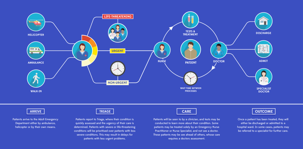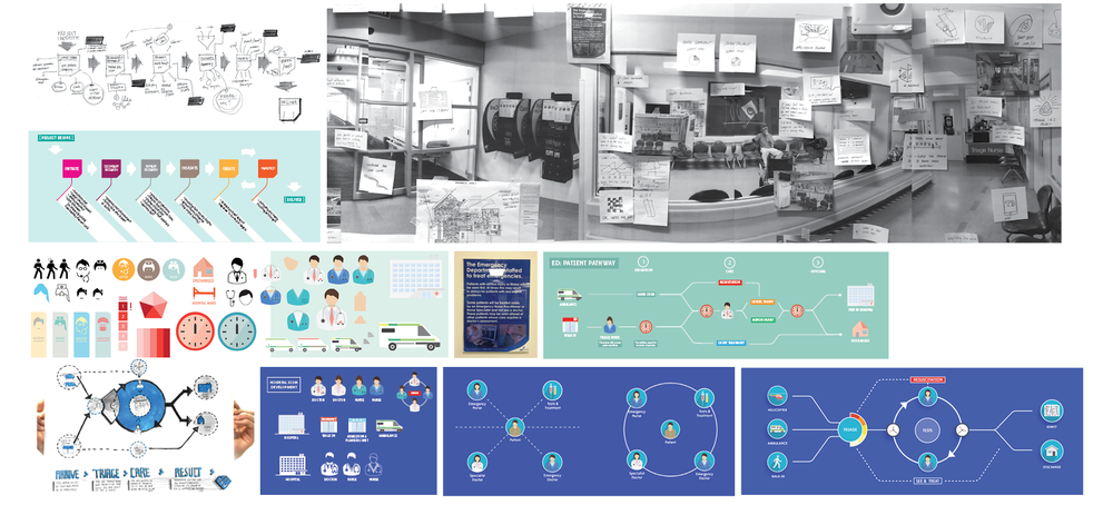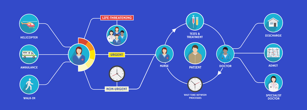
This project has been undertaken with staff in the AED at the Grafton campus, Auckland DHB. We have sought to understand and unpack the journey of a patient through the Emergency Department, and visually communicate to patients how the service works. This is of specific importance for patients and family who have to wait for long periods during their care, as other patients with more severe conditions may have been prioritised over them. With such a large number of care pathways that a patient could experience, the challenge has been to design a simple and understandable representation of the whole service. The goal of the project is that patients and families who have a clearer picture of why they must wait (for example, because staff resource is being tied up with a life threatening emergency) will have reduced levels of anxiety and frustration. Designing out complexity has been the main challenge of this graphic design exercise.
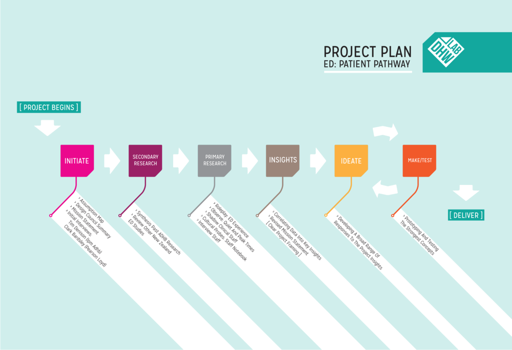
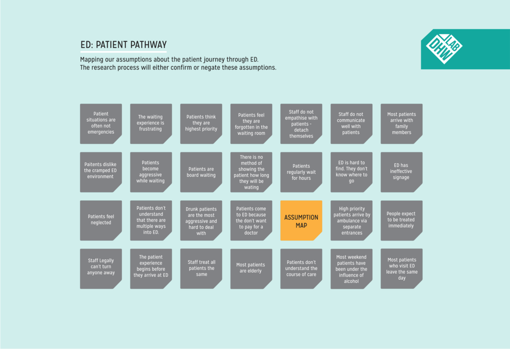
Project Mapping
Unpacking the AED Waiting room experience.

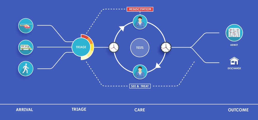
 Designing Iconography and developing a visual language to represent different people and processes in the AED.
![]()
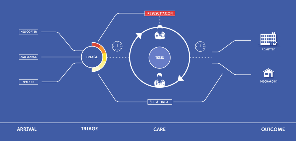
Iterating and refining a simple, high level map of how patients move through the AED.
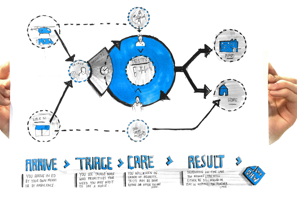

The final design was achieved by working Collaboratively with AED staff.
The next stage of this project is to receive formal feedback from users and develop an animation for screens situated in the ED waiting room as well as flat vinyls at different points the AED.
