ED project

Patient Pathway Development

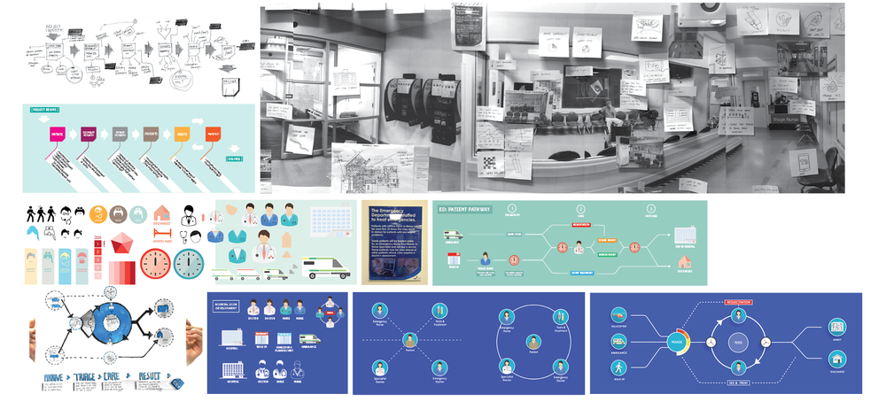
Much of our recent work and collaboration with ED staff has focused on the development of the ED Signage and, as a result, development of the main project - Patient Pathway - has somewhat slowed. In order to give this project new momentum, we needed to get some real feedback on our current understanding of the Adult Emergency Department patient journey. We had developed a series of journey map iterations and a graphic/visual language, which we were able to present to the Facilities Nurse yesterday for discussion and feedback. This was the first opportunity to get some critical feedback from ED staff, and would allow us to test our initial assumptions/understanding and push the project forwards. Feedback regarding visual iconography:

  • As clinicians, we have the responsibility to communicate more to patients
  • Generally doctors in ED wear blue scrubs, surgical doctors wear teal, specialists wear mufti, nurses wear blue scrubs, charge nurses wear red, flow nurses wear green - overall, not very clear
  • Coloured, detailed icons could be used to demonstrate/communicate different staff roles
  • Medical equipment details could also be used to differentiate roles - e.g. clinical staff wear stethoscopes, non-clinical do not
  • A colour key could help patients/families understand the different staff roles within ED
  • Plain, white icons are quite good for keeping things neutral - gender/culture
  • Would be useful/helpful to explain different triage categories
  • Helpful to communicate and define department terminologies - Triage is a term we want to educate people around; it is internationally used and has an interesting historical background

Icon Development Print

Feedback regarding journey map:

  • Walk-in patients and patients brought in by ambulance all come through triage
  • Triage direct St John paramedics to different areas
  • Triage is a key component of four stages: Arrival, Triage, Nursing Assessment, Medical Assessment
  • Five main areas: Resus, Acutes, Monitoring, waiting room and APU
  • No matter what location, each patient is assessed by a nurse
  • As a patient story develops, their category/priority may change
  • Tests generally happen before being seen by a doctor
  • Not all cases are 'injuries' - may be medical or surgical problems also
  • Final stage should simply be kept to 'Admitted' or 'Discharged'
  • As for the location of the journey map, it was suggested we replace the large mat hung on the waiting room wall

Journey Map Draft

With such a complex set a variable care pathways, it is tricky to refine a journey map down to a simple, coherent graphic. Our current line of thought focusses the journey map on a central ‘care cycle’ where tests as well as doctor and nurse assessments can take place in any order (as is often the case in ED).

journey process

ED: PATIENT PATHWAY SIGNAGE/PROTOTYPING

3aa8b-modeling.jpg

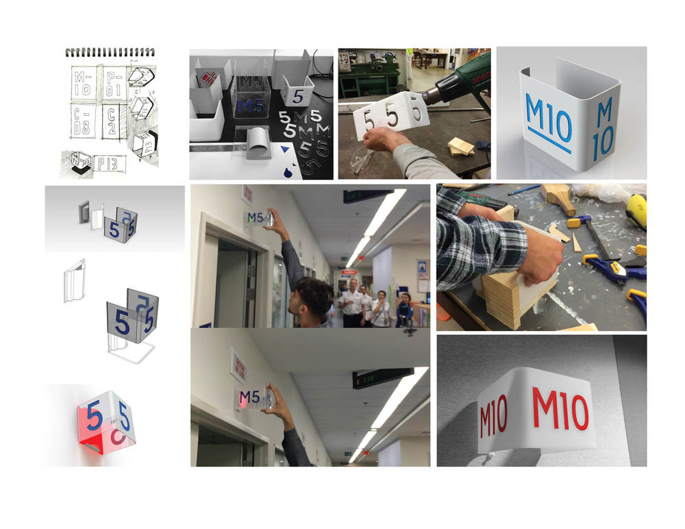
One of the spin-off projects from developing a visual patient journey map includes a simple 3D room sign. The concept responds to the issue of obscured and unclear room signage, noted by the ED nurse manager on a walkthrough earlier in the project. An acrylic sheet is heat bent to create three faces for the room number and is visible for the patients and families walking in the corridors, as well as the nurses station in the centre of the ED. We have received some great feedback from the Facilities Nurse, who supervised a short trial of a prototype in-situ, and gave us the green light to resolve a fully functioning prototype for testing. An exciting possibility for the concept lies in an existing LED light panel above each room. The warning light has three settings to inform the nurses about what is happing in each room: green, orange and red. Our hope is that if the acrylic sign was clear with opaque numbers, it could retrofit directly over the LED panel, causing the sign to illuminate…

https://www.youtube.com/watch?v=CISOyItVEdk&feature=youtu.be

After a second go at prototyping around the ED Signage, we uncovered a few key issues to be resolved. As identified in previous posts, we identified the opportunity to retrofit the three sided sign over the existing warning light panel, which has green, orange and red LEDs for different types of assistance. The goal of this concept was to use the sign as a catalyst for enhancing the luminosity of these LED panels. We built a series of prototypes exploring the scale, form and different material transparencies...

Issue 1: The lettering needs to be explicitly clear. After building a prototype with transparent material, we found that people would see straight through to the lettering on the opposite face. To resolve this, we created a 'fogged' surface by sanding the clear acrylic. This fogged surface behaved really well with the red LEDs, reflecting the light and causing the sign to glow (see video below).

Issue 2: This leads to the second issue encountered through making and testing. We had the opportunity to show the nursing staff in the ED and receive their feedback. Although they were really impressed with the retrofit concept, they felt that the signage was slightly obstructing their view when the dimmer, green LED's were flashing.

We discussed with the nursing staff about their conclusions from the testing session in ED. It was resolved that although we had some success in achieving a 'glowing' effect, there was too much risk involved in obscuring the warning lights. They also felt that the signage would work better at a lower height to allow people from all directions easily navigation through the department. From here, we will further develop the visual impact and aesthetics of the design. We aim to have a new round of prototypes installed in the space very soon so check back soon!

STAFF AND CLINICIAN NOTE BOOK

Synthesising user insights can be a real challenge while researching new design opportunities. In the context of the Emergency Department and Auckland Hospital, staff have been trained to work in a certain way, following specific terminology and protocols in order to run an efficient Emergency service. Day in and day out they encounter patients who are unable to make sense of the service pathway they offer and they work around clumsy or unconsidered aspects of their graphic, spacial or product environment... The DHW lab 'Staff and Clinician Notebook'  has been developed to help the Staff and Clinician user group to capture key insights from their day to day experience of the ED. The notebook is a practical way in which designers are able to catch a glimpse inside a patients' pathway through the ED  from a staff perspective.

Key methods from the notebook include:

See, hear, think feel - A simple fill in the blanks exercise aimed at unpacking specific service situations in the ED.

Test your Assumptions - A reflective tool designed to question assumptions the staff make about the ED patient experience.

The Five Whys - Used to delve deeper into the underlying motivations for a specific behavior or opinion.

Storyboarding - A series of drawings that visualise a specific patient experience in a sequence of events.

Heres' an Idea - An opportunity for staff to write down or draw ideas they have for how to improve the patient journey through ED.

This first Iteration of the 'Staff and Clinician's Notebook' is a prototype. Testing this Method and receiving feedback from staff will allow us to improve and refine this research technique for the projects ahead.

notebook

ED: Patient Pathway

We are excited to be starting our first DHW Lab project for 2014, focusing on designing new ways to communicate the Emergency Department to help improve the experience for those arriving in ED at the ADHB’s Auckland City Hospital in Grafton.The waiting room of the ED can be a place of high anxiety, frustration, and sometimes aggression. Commonly visitors arriving to the service are uncertain about where to go, who to see, how long do they need to wait, and well as not understanding why some patients may be prioritized over others.

This first DHW Lab project asks how visual communication can be used to help patients to understand their pathway through the ED, in order to explore how design can be used to deliver new healthcare experiences

Currently, two Lab staff are working closely with staff from the ED, as well as the service improvement team to better understand the challenges associated with this busy and complex area of the hospital.  It is hoped that  new opportunities for design led solutions will be identified through this collaborative approach.

The team is currently undertaking secondary research and gathering primary data . See the current project map below and follow us as we design and learn…

Project Plan

ED plan