Recently, we posted an article about engaging pharmacy staff in a co-design exercise, in order to improve their current service offering.
As a low scale solution and a method for gathering further insight, a few of the Lab team reorganised and decluttered the current layout and product offering in the pharmacy. This created significantly more transparency around the prescription counter, and a much clearer flow in and out of the space. The changes have made it much easier to identify the prescription desk from outside the shop. Staff are excited by the changes and the next stage for the lab will be to gauge user response.
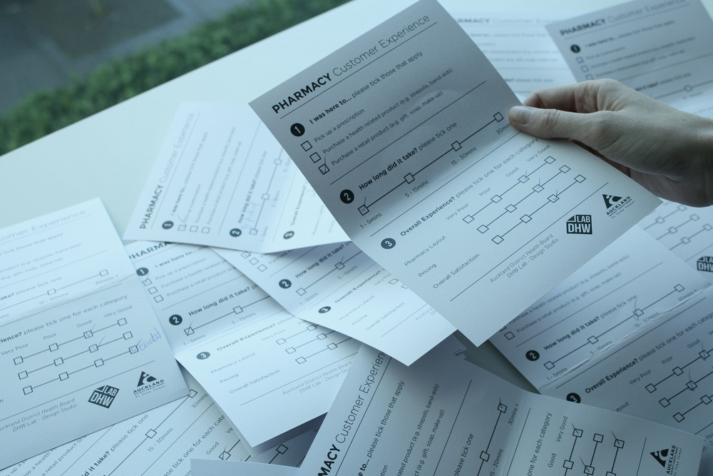
The first round of 115 feedback forms have been collected based on peoples' experience of the original layout, and the next data sampling will be based on the improvements. This will provide a solid foundation from which to develop more permanent and compressive improvements to the pharmacy.


