The lessons we learnt from prototyping Starship Outpatients.

IMG_1402.jpg
IMG_1389.jpg

We installed wayfinding prototypes in Starship Outpatients which has recently been refurbished. The department has a high number of different clinics running through this space on any given day. Due to this, there are a variety of patient journeys and processes. We needed to test our ideas to see what would work best to try streamline patient journeys through the space, taking into consideration current and future process changes. 

Tiled A3's were spray glued on coreflute and hung in the space. Rather than prototyping signage for the entire department, one route was chosen to test. When installed, we sought feedback from families and staff in the space, to gauge what was working, and what needed improvement. The iterative and low-fi nature of the designs meant we could quickly respond with changes.  

Going forward we're now consolidating the lessons learnt from prototyping, and incorporating these into the final design for install. 

IMG_0784_.jpg
IMG_0857.jpg
IMG_0852 copy.jpg
IMG_0881.jpg
IMG_1386.jpg
IMG_1376.jpg

CO-DESIGNING WITH ADOLESCENTS WITH PSYCHOSIS: Workshop 2

Card sort activity to organise content and information

Yesterday, Nick and Ivana ran a second co-design workshop with young adults with psychosis. Unlike the first workshop, this workshop was based in the community at the Taylor Centre in Ponsonby. We had a range of participants who each shared their own experiences of living with psychosis, and helped us understand their day-to-day challenges. Through a series of interactive activities, we explored how an app or website could support their needs and help them live well with psychosis. 

43ce5-personabasedempathystudypersonabasedempathystudy.jpg
d19e2-exploringideasforappfunctionalityandcontentexploringideasforappfunctionalityandcontent.jpg

The findings we collected will help to inform the direction and design of early concepts and the types of content users value. 

Co-design Workshop with Senior Citizens

Here at the DHW Lab, we aim to put users at the centre of everything we do. Last week was a great example of this, with our resident anthropologist Guy Collier and UX designer Nick Hayes, running a co-design workshop with a small group of senior citizens to explore the challenges associated with changes to memory and thinking.

324b4-img.jpg

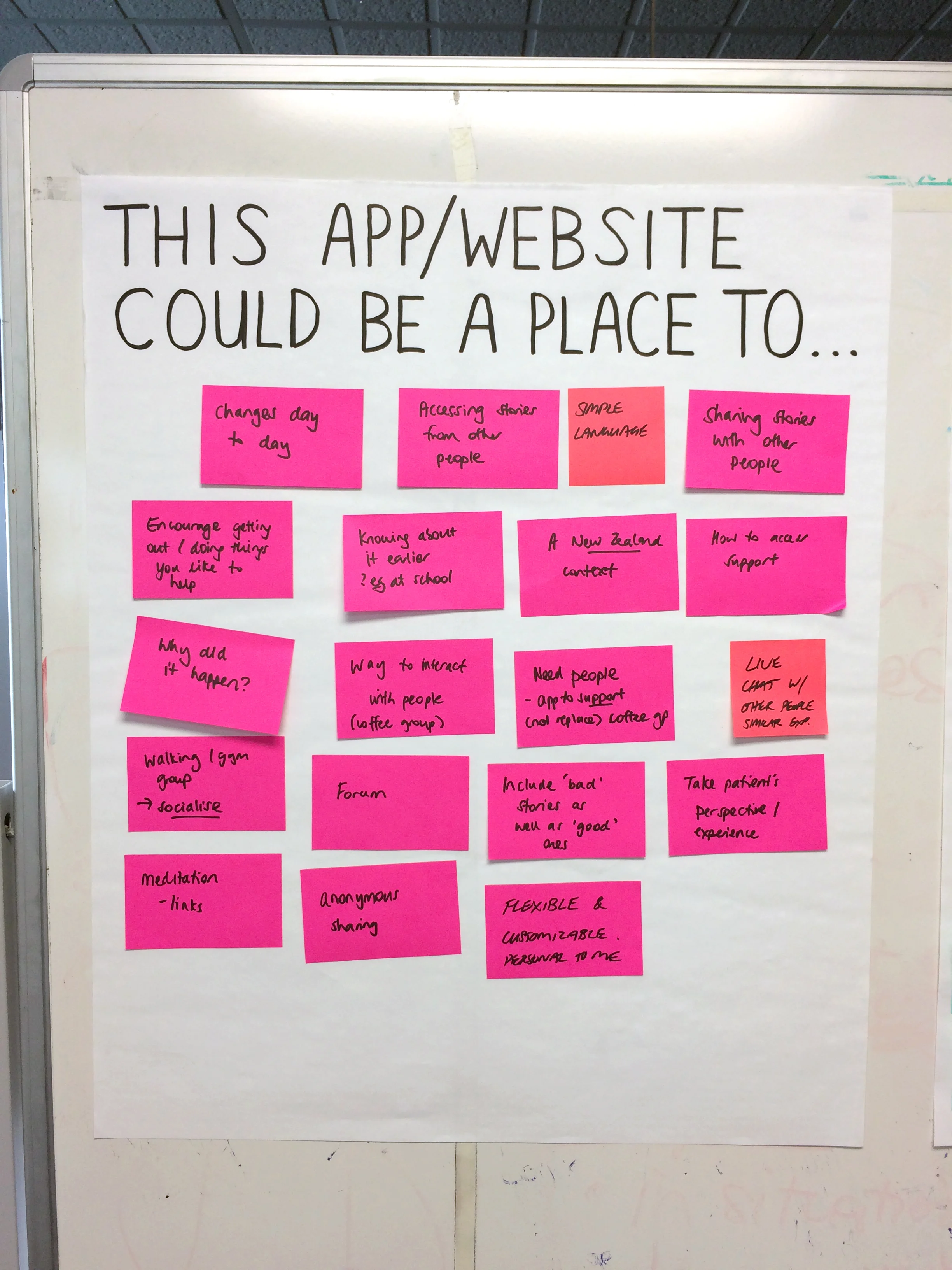
Through the workshop, Nick and Guy explored the lived experience of changes to memory and thinking, and the associated day-today-day challenges. Participants then engaged in activities to explore how an online resource, such as a website, might support their experiences. Numerous ideas were generated including community engagement and forums, sharing strategies, and peer-to-peer support. 

a7122-img.jpg

Development of these ideas and other solutions will continue to be explored through subsequent workshops involving participants throughout the process. 

A special thanks to Brain Research New Zealand and the Centre for Person Centred Research at AUT for sponsoring this important type of work.

3D scanning

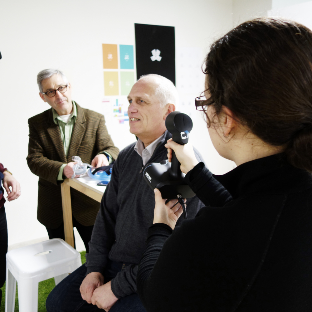
As an environment, the lab strives to foster collaborative working relationships between design and health. Dave White, an Engineer at Auckland University of Technology, works in the area of respiratory mask design and has received funding for a 3D scanner. The device is able to map three dimensional objects accurately, and translates information into a CAD file. Technology like this is not confined to developing new concepts in the field of resipratory health, but can be used in any number of health product applications.

DSC06306 Edited

These types of technologies are of significant benefit to researchers looking to explore new ways of designing health products. Helen Cunningham, pictured in this photo is currently developing her PhD in Respiratory mask design and is stoked to have access to kit of this quality!

Transition Lounge Signage

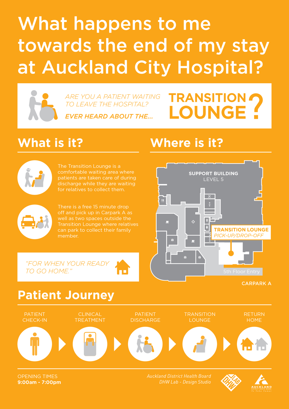
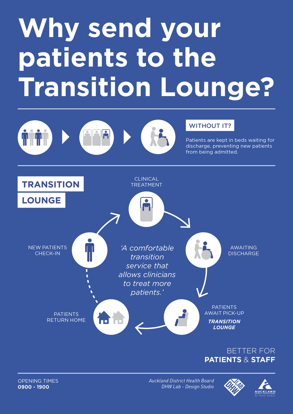
As apart of the lab's work to improve public spaces, we are working with staff on a campaign to help both patients and other hospital wards understand how to use the Transition Lounge:Transition Lounge Awareness Patients Final Transition Lounge Awareness Staff Final

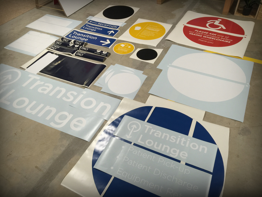
In addition to this campaign, we are testing a new signage and way finding language in the space. Using an in-house vinyl cutter we are able to quickly mock up signage solutions and test there suitability before install.

Transition Lounge

Pharmacy redesign: Low scale solution

before after

Recently, we posted an article about engaging pharmacy staff in a co-design exercise, in order to improve their current service offering.

As a low scale solution and a method for gathering further insight, a few of the Lab team reorganised and decluttered the current layout and product offering in the pharmacy. This created significantly more  transparency around the prescription counter, and a much clearer flow in and out of the space. The changes have made it much easier to identify the prescription desk from outside the shop. Staff are excited by the changes and the next stage for the lab will be to gauge user response.

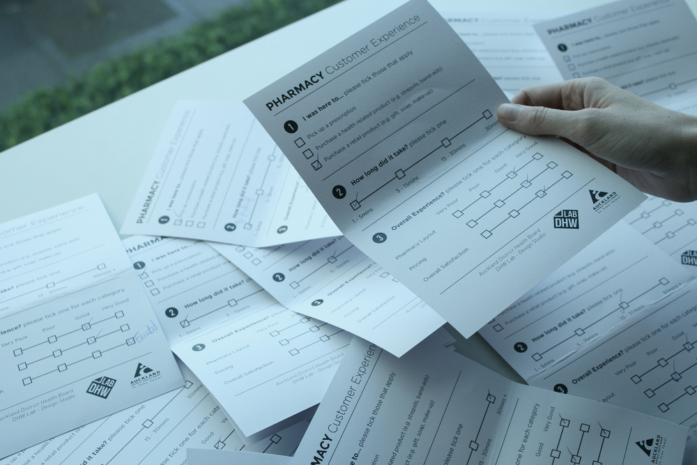
The first round of 115 feedback forms have been collected based on peoples' experience of the original layout, and the next data sampling will be based on the improvements. This will provide a solid foundation from which to develop more permanent and compressive improvements to the pharmacy.

feedbackbox