signage

Transition Lounge Installation

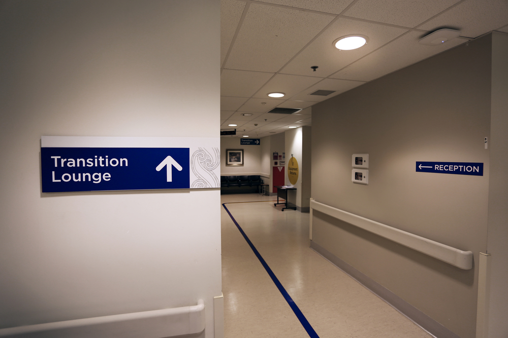
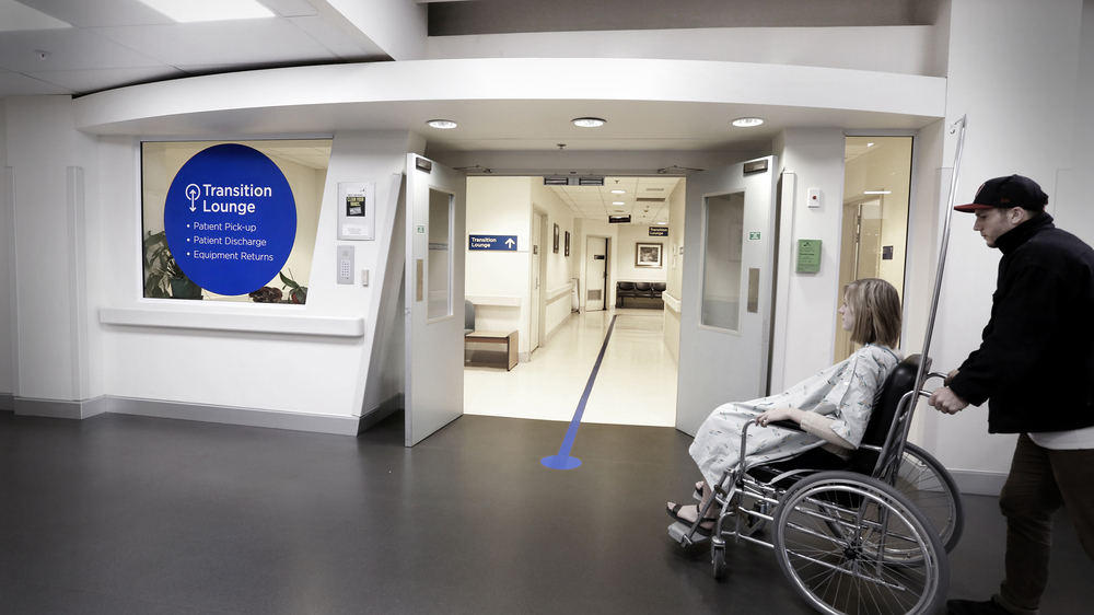
Recently, we posted about installing a new set of signage designs for the Transition Lounge ward in the Level 5 public space. The job has been completed along side a  awareness campaign for the services offered by the Transition Lounge. A similar exercise is currently underway with ED waiting room to communicate key information and visual cues through simple, bold colour blocking. These hi-fi prototypes are ideal for testing in the hospital and contribute to a more informed approach to way finding hospital wide. Transition Lounge Photo small Transition Lounge 2Wheelchair
In Situ Posters

Transition Lounge Signage

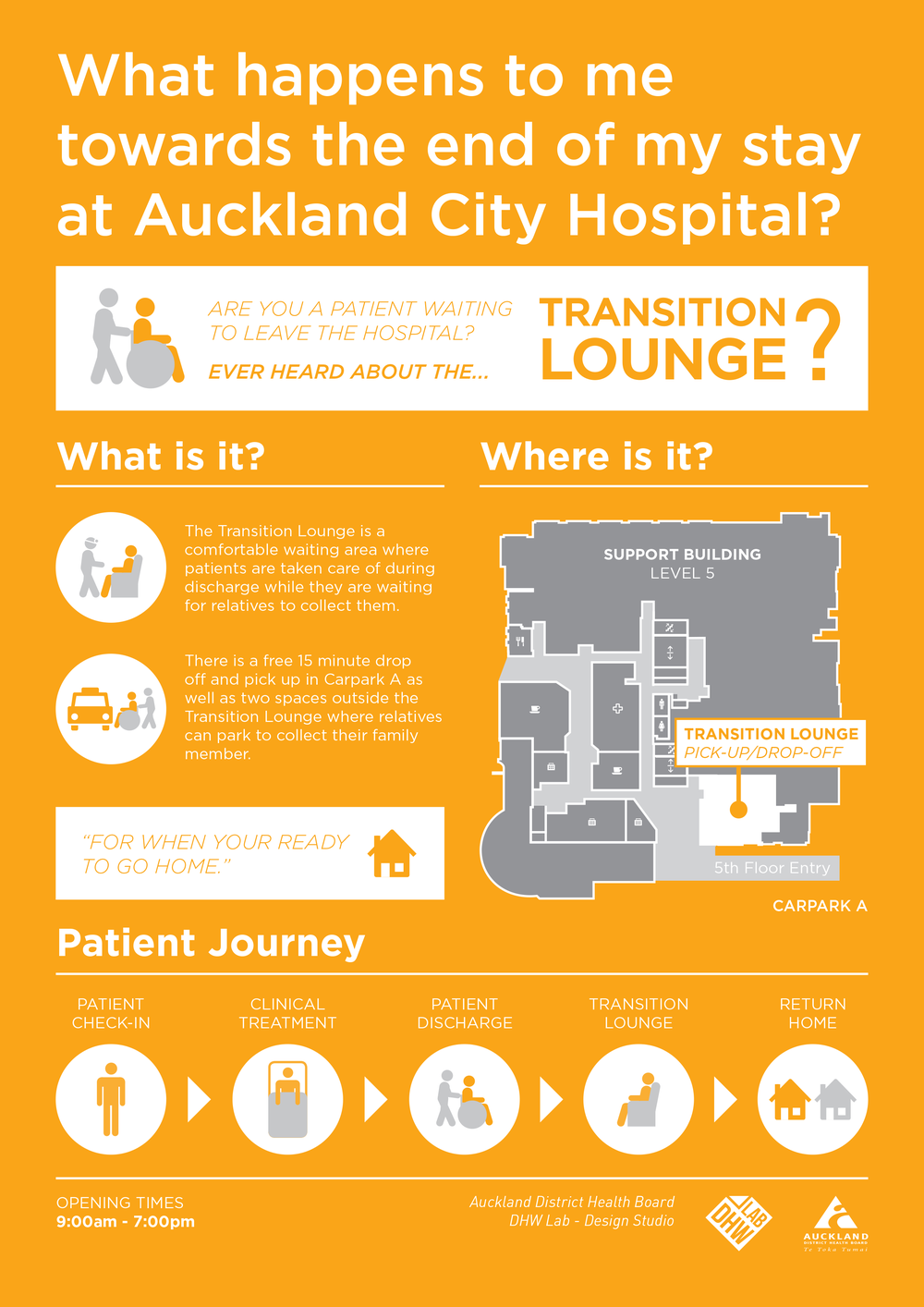
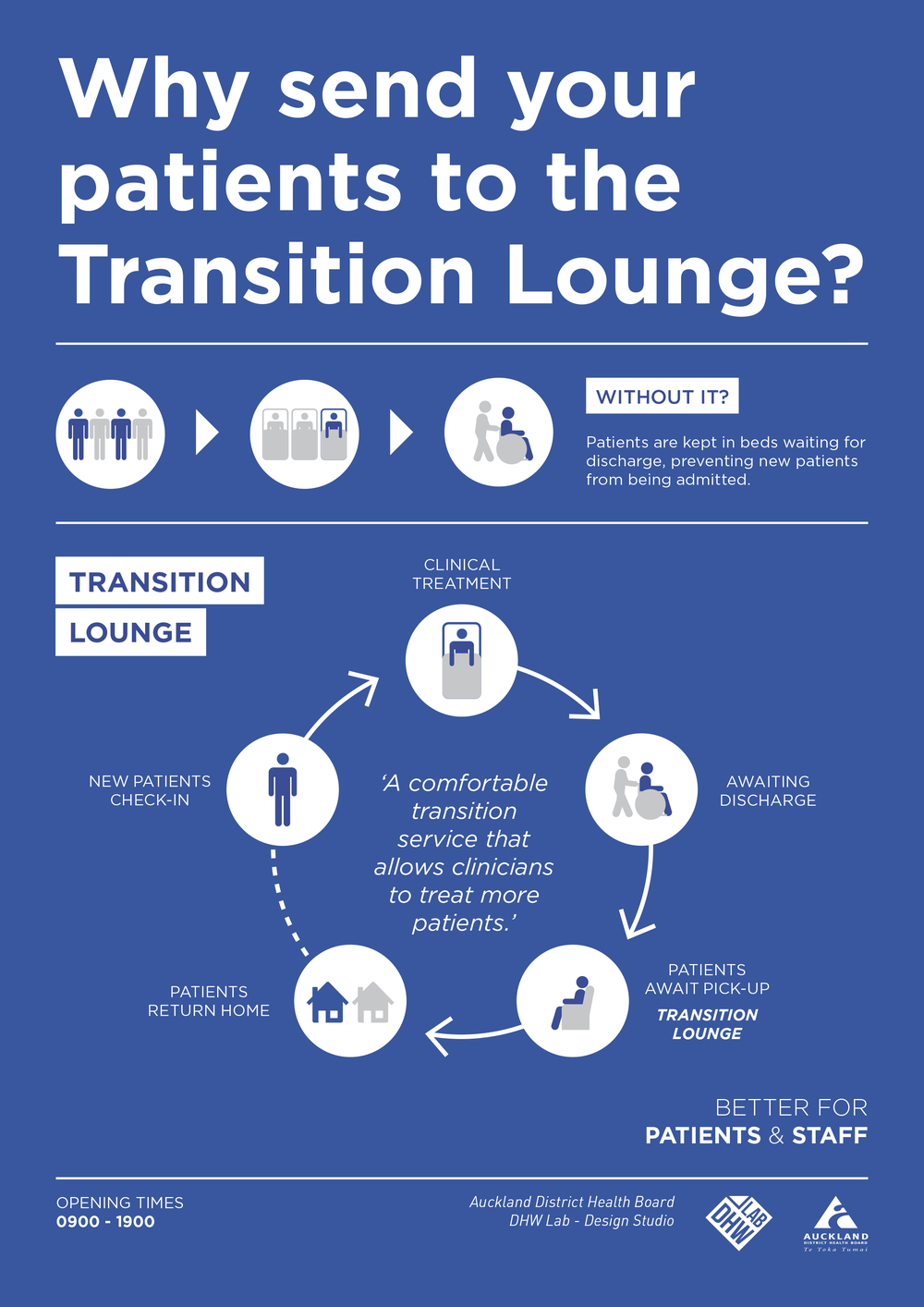
As apart of the lab's work to improve public spaces, we are working with staff on a campaign to help both patients and other hospital wards understand how to use the Transition Lounge:Transition Lounge Awareness Patients Final Transition Lounge Awareness Staff Final

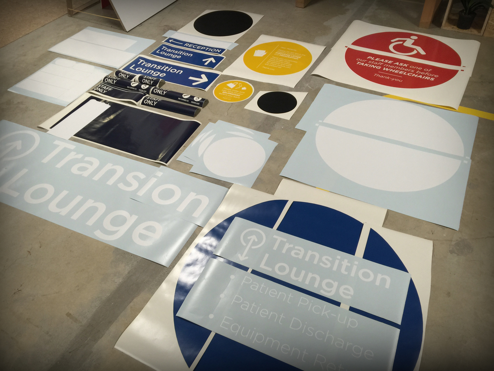
In addition to this campaign, we are testing a new signage and way finding language in the space. Using an in-house vinyl cutter we are able to quickly mock up signage solutions and test there suitability before install.

Transition Lounge

Temporary Signage: Level 5

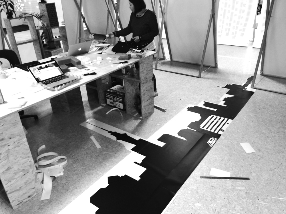
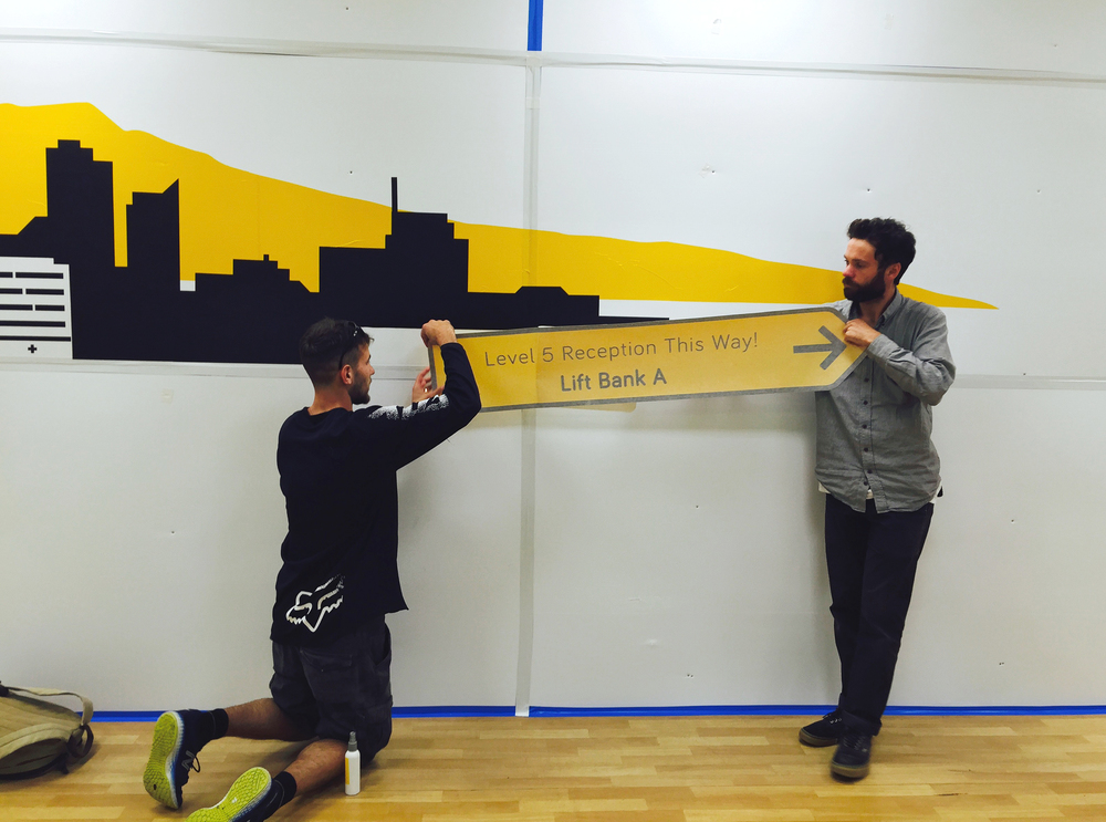
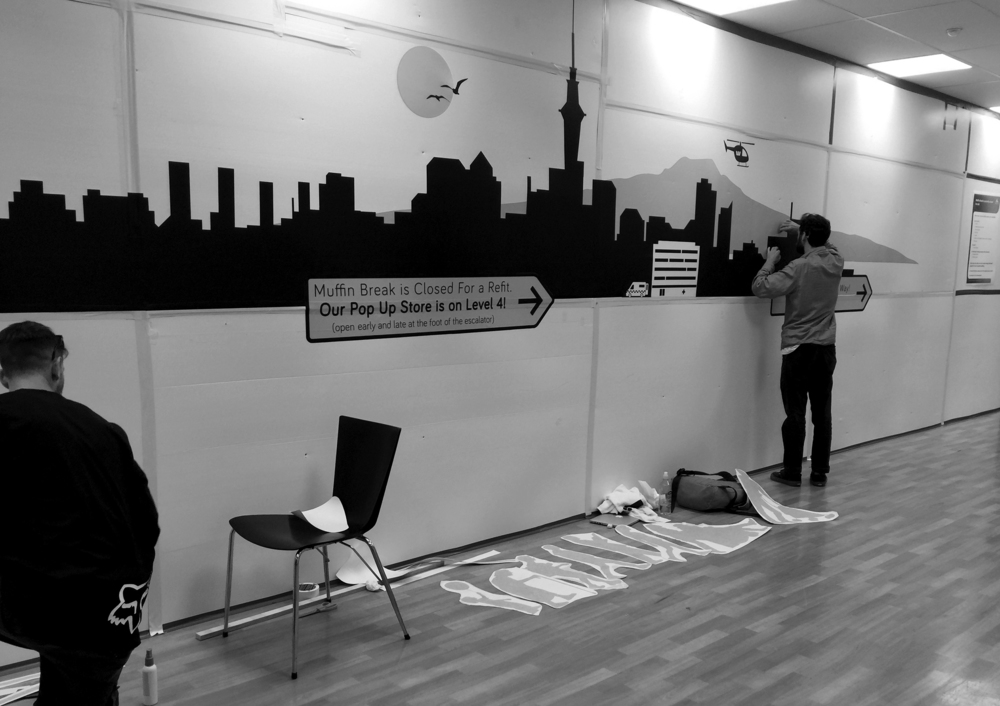
Recently, some construction work has taken place in the Level 5 retail space creating a bottle neck around the staff cafeteria. The Lab has installed a way finding mural in order to help the flow of people into the over bridge and reception area. It was exciting to hear people's feedback as we installed the piece. The colour and playful aesthetic has created quite a talking point for both young and old!

stage 1 stage 2 stage 4 stage 5 stage 6 stage 7

AED Wayfinding and Information Design

isometric wayfinding-01 This document is intended to begin the discussion with AED staff about how to improve the wayfinding and signage design in the department. It focuses specifically on the AED waiting room and how to get there. The document is a mix of problem framing and early concept work.

Check out the PDF below...

AED signage:information

Marino Ward Signage

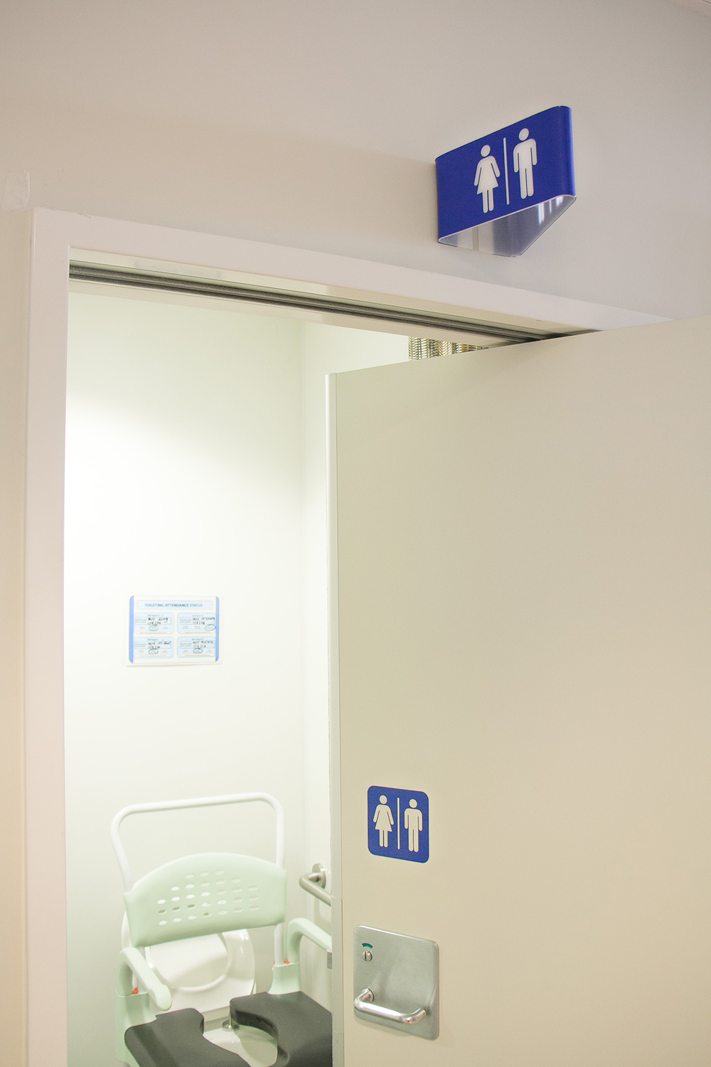
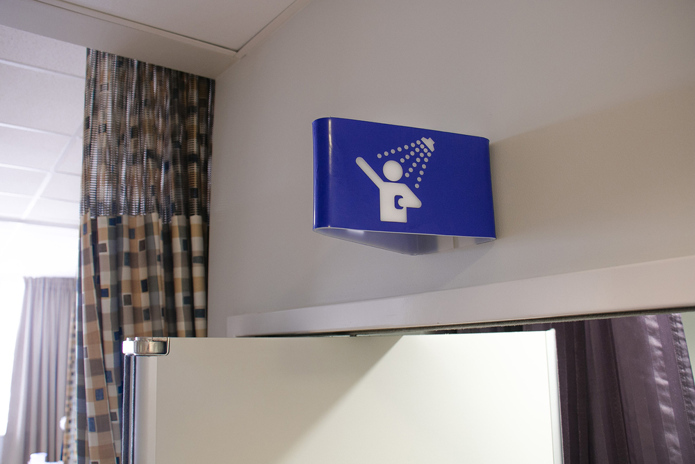
As part of our on-going efforts to prototype and test new signage/way finding concepts for the hospital, the Marino Ward on level 14 recently had a set of prototypes installed. The Lab worked with staff and the service improvement manager who have been concentrating their efforts on initiatives to reduced the number of falls around the toilets and showers. The signage has been well received and similar to AED feedback, there is scope to develop backlighting for the designs. Marino Signage_2 Marino Signage_6 Marino Signage_7

ED: Patient Pathway Signage Process

a651a-photo-8-05-14-4-54-26-pm.jpg

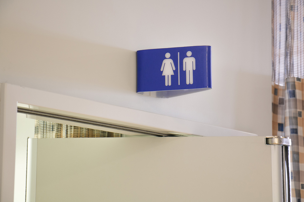
Since our last post on the ED signage project, we have spent some time resolving the details of the physical form, typography, colour and sourcing materials. We slightly extended the length of the sides of the sign, whilst retaining a more square profile for the front face. This allows the letting to sit further out from the folded edge where it attaches to the wall, improving visibility. We managed to find a soft-looking, white matte acrylic material to use for the signage body, and experimented with a variety of coloured vinyls for the typography. After consulting with staff in the Adult Emergency department, we settled on a matte red vinyl which creates a consistency with the red wayfinding line that runs through the department. The combination of low reflective, matte materials allows the typography to 'pop' off the body of the sign, which disappears into the white walls.

a651a-photo-8-05-14-4-54-26-pm.jpg

Having resolved these finer details, we are now ready to produce a small batch run for the Adult Emergency department. We developed a CNC routed MDF former, which we will use to manufacture the first lot of signs. The process is very simple and straight forward: the sign blanks are laser cut out of a flat sheet of acrylic, which we then attach to the MDF former and use a heat gun to bend around the corners of the former. Finally, we cut the lettering from a vinyl sheet then press it to the folded blanks. Easy. We're excited to get these up in the ED to see how patients and staff respond to them, and to document the effect they have on improving wayfinding within the department.