LEVEL 5: Storytelling
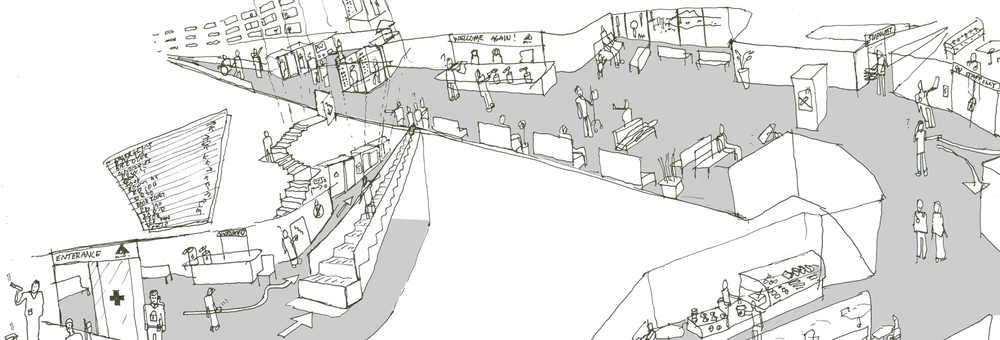
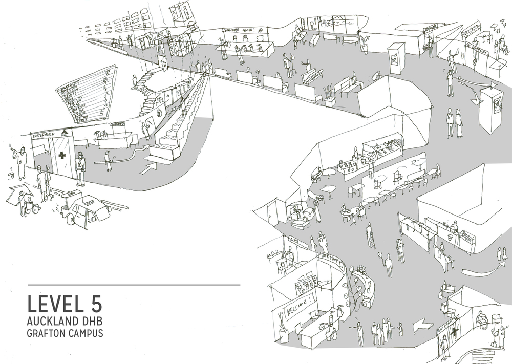
Level 5 of the Auckland DHB Grafton campus is main floor of the hospital. Currently, the space is being reconsidered in the way it provides a welcome to hospital users and how it represents the values of the Auckland DHB. There are an incredible number of users of this space with just as many services being provided. Some primary research has been undertaking by a team at the ADHB to unpack and understand the complexity of this multi-use space. The DHW lab has been asked to help with packaging up this initial research phase of the project and communicate what has been done to date. Here is an impression of what the level 5 space is like to help us get our head around how we might tell the story of level 5 , and where it could be taken in the future.
Patient Pathway Development
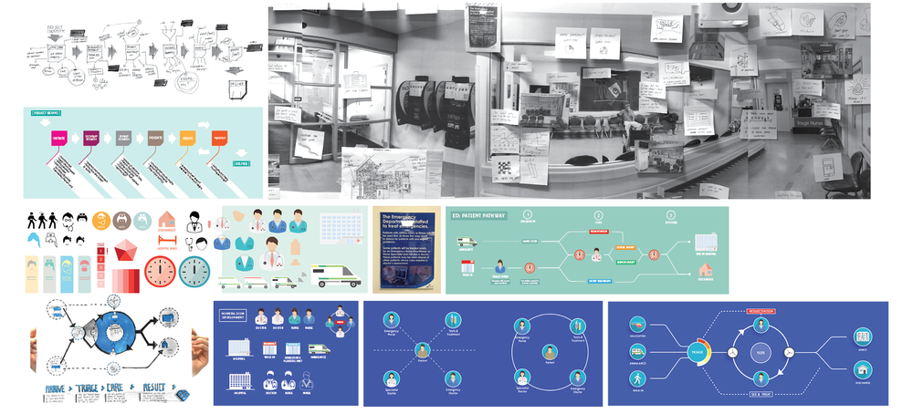
Much of our recent work and collaboration with ED staff has focused on the development of the ED Signage and, as a result, development of the main project - Patient Pathway - has somewhat slowed. In order to give this project new momentum, we needed to get some real feedback on our current understanding of the Adult Emergency Department patient journey. We had developed a series of journey map iterations and a graphic/visual language, which we were able to present to the Facilities Nurse yesterday for discussion and feedback. This was the first opportunity to get some critical feedback from ED staff, and would allow us to test our initial assumptions/understanding and push the project forwards. Feedback regarding visual iconography:
- As clinicians, we have the responsibility to communicate more to patients
- Generally doctors in ED wear blue scrubs, surgical doctors wear teal, specialists wear mufti, nurses wear blue scrubs, charge nurses wear red, flow nurses wear green - overall, not very clear
- Coloured, detailed icons could be used to demonstrate/communicate different staff roles
- Medical equipment details could also be used to differentiate roles - e.g. clinical staff wear stethoscopes, non-clinical do not
- A colour key could help patients/families understand the different staff roles within ED
- Plain, white icons are quite good for keeping things neutral - gender/culture
- Would be useful/helpful to explain different triage categories
- Helpful to communicate and define department terminologies - Triage is a term we want to educate people around; it is internationally used and has an interesting historical background
Feedback regarding journey map:
- Walk-in patients and patients brought in by ambulance all come through triage
- Triage direct St John paramedics to different areas
- Triage is a key component of four stages: Arrival, Triage, Nursing Assessment, Medical Assessment
- Five main areas: Resus, Acutes, Monitoring, waiting room and APU
- No matter what location, each patient is assessed by a nurse
- As a patient story develops, their category/priority may change
- Tests generally happen before being seen by a doctor
- Not all cases are 'injuries' - may be medical or surgical problems also
- Final stage should simply be kept to 'Admitted' or 'Discharged'
- As for the location of the journey map, it was suggested we replace the large mat hung on the waiting room wall
With such a complex set a variable care pathways, it is tricky to refine a journey map down to a simple, coherent graphic. Our current line of thought focusses the journey map on a central ‘care cycle’ where tests as well as doctor and nurse assessments can take place in any order (as is often the case in ED).
ID Card: What's on your lanyard?

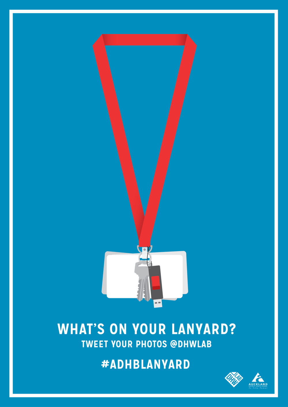 After discovering a number of journal articles, which document the risk of infection posed by lanyards, our initial response was to design lanyards out of the ID card system. However, when you're in the hospital environment you quickly realise just how widespread the use of lanyards are, and just how many things staff attach to them. To help us understand the ways in which staff use their lanyards, we thought of a simple campaign that would allow staff members to take photos of their lanyards and tweet them to us.
ED: PATIENT PATHWAY SIGNAGE/PROTOTYPING
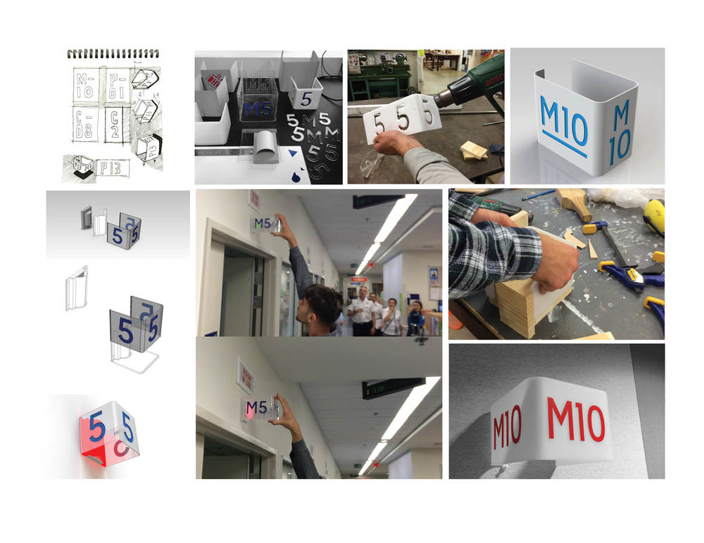
One of the spin-off projects from developing a visual patient journey map includes a simple 3D room sign. The concept responds to the issue of obscured and unclear room signage, noted by the ED nurse manager on a walkthrough earlier in the project. An acrylic sheet is heat bent to create three faces for the room number and is visible for the patients and families walking in the corridors, as well as the nurses station in the centre of the ED. We have received some great feedback from the Facilities Nurse, who supervised a short trial of a prototype in-situ, and gave us the green light to resolve a fully functioning prototype for testing. An exciting possibility for the concept lies in an existing LED light panel above each room. The warning light has three settings to inform the nurses about what is happing in each room: green, orange and red. Our hope is that if the acrylic sign was clear with opaque numbers, it could retrofit directly over the LED panel, causing the sign to illuminate…
https://www.youtube.com/watch?v=CISOyItVEdk&feature=youtu.be
After a second go at prototyping around the ED Signage, we uncovered a few key issues to be resolved. As identified in previous posts, we identified the opportunity to retrofit the three sided sign over the existing warning light panel, which has green, orange and red LEDs for different types of assistance. The goal of this concept was to use the sign as a catalyst for enhancing the luminosity of these LED panels. We built a series of prototypes exploring the scale, form and different material transparencies...
Issue 1: The lettering needs to be explicitly clear. After building a prototype with transparent material, we found that people would see straight through to the lettering on the opposite face. To resolve this, we created a 'fogged' surface by sanding the clear acrylic. This fogged surface behaved really well with the red LEDs, reflecting the light and causing the sign to glow (see video below).
Issue 2: This leads to the second issue encountered through making and testing. We had the opportunity to show the nursing staff in the ED and receive their feedback. Although they were really impressed with the retrofit concept, they felt that the signage was slightly obstructing their view when the dimmer, green LED's were flashing.
We discussed with the nursing staff about their conclusions from the testing session in ED. It was resolved that although we had some success in achieving a 'glowing' effect, there was too much risk involved in obscuring the warning lights. They also felt that the signage would work better at a lower height to allow people from all directions easily navigation through the department. From here, we will further develop the visual impact and aesthetics of the design. We aim to have a new round of prototypes installed in the space very soon so check back soon!
Project: Identity

A current side project underway at the lab that involves rethinking the design and function of the hospital ID card. Typically, the ID card is attached to a lanyard hanging around the neck of a staff member. They can also be clipped onto clothing.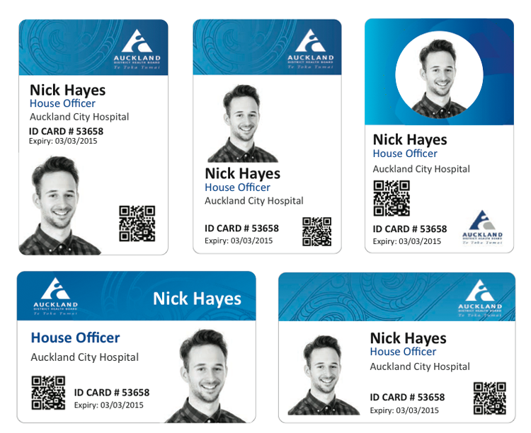 At face value, the project seemed to be re-branding exercise, redesigning the graphics of the current card. But pushing the boat out a little, we began to question what the underlying purpose of the ID card was: How easy is it for patients to identify staff members? What are the key problems with the existing, lanyard/clip system? With a little research, we discovered that staff carried around three items on their lanyard: an Id card a coffee card and swipe card- how might such functions be combined or integrated? A nurse tipped us off about the infection risk of lanyard card holders, and some key secondary sources supported this issue of spreading infection through the current system. How might an ID card system actively promote sanitation as staff move around the hospital? With these new insights, we have jumped back into ideation around this problem, and are looking for opportunities to develop an ID system that is both feasible and effective for all users:

