Marino Ward Signage

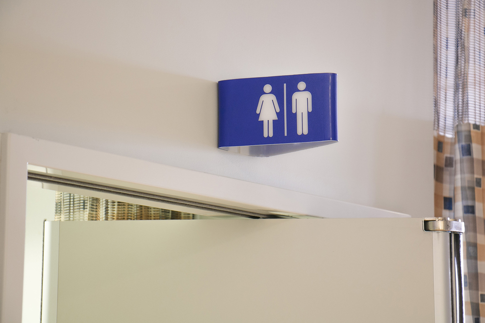
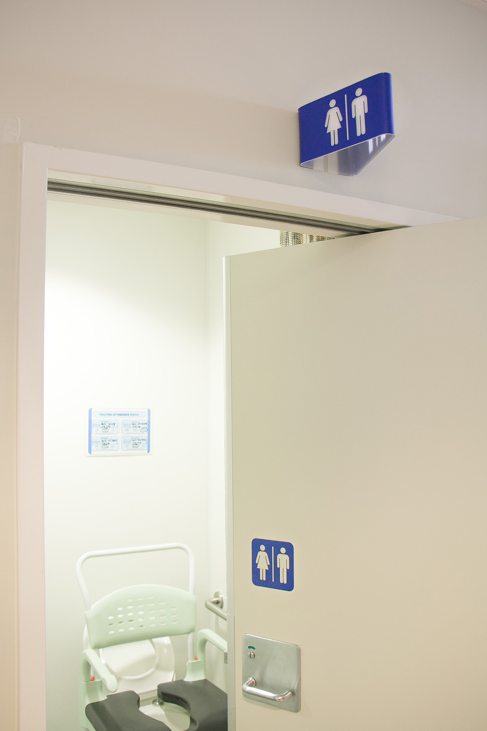
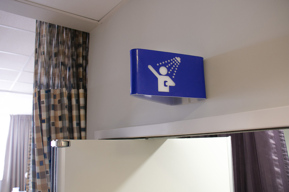
As part of our on-going efforts to prototype and test new signage/way finding concepts for the hospital, the Marino Ward on level 14 recently had a set of prototypes installed. The Lab worked with staff and the service improvement manager who have been concentrating their efforts on initiatives to reduced the number of falls around the toilets and showers. The signage has been well received and similar to AED feedback, there is scope to develop backlighting for the designs.
Makerbot for the LAB

Rapid prototyping technology is becoming an inseparable component of design. 3D printing is especially useful for quickly visualising complex forms that would otherwise be impossible to model quickly and cheaply. We are excited to have our own MakerBot printer for design lab staff and student projects and there is massive potential within healthcare to leverage 3D printing for better health care experiences.
ED: Patient Pathway Signage Process
Since our last post on the ED signage project, we have spent some time resolving the details of the physical form, typography, colour and sourcing materials. We slightly extended the length of the sides of the sign, whilst retaining a more square profile for the front face. This allows the letting to sit further out from the folded edge where it attaches to the wall, improving visibility. We managed to find a soft-looking, white matte acrylic material to use for the signage body, and experimented with a variety of coloured vinyls for the typography. After consulting with staff in the Adult Emergency department, we settled on a matte red vinyl which creates a consistency with the red wayfinding line that runs through the department. The combination of low reflective, matte materials allows the typography to 'pop' off the body of the sign, which disappears into the white walls.
Having resolved these finer details, we are now ready to produce a small batch run for the Adult Emergency department. We developed a CNC routed MDF former, which we will use to manufacture the first lot of signs. The process is very simple and straight forward: the sign blanks are laser cut out of a flat sheet of acrylic, which we then attach to the MDF former and use a heat gun to bend around the corners of the former. Finally, we cut the lettering from a vinyl sheet then press it to the folded blanks. Easy. We're excited to get these up in the ED to see how patients and staff respond to them, and to document the effect they have on improving wayfinding within the department.
Patient Pathway Development
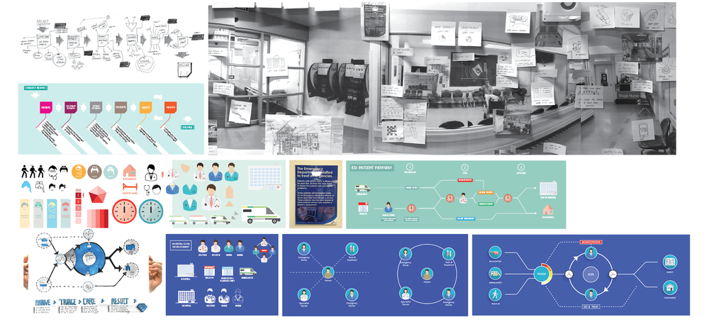
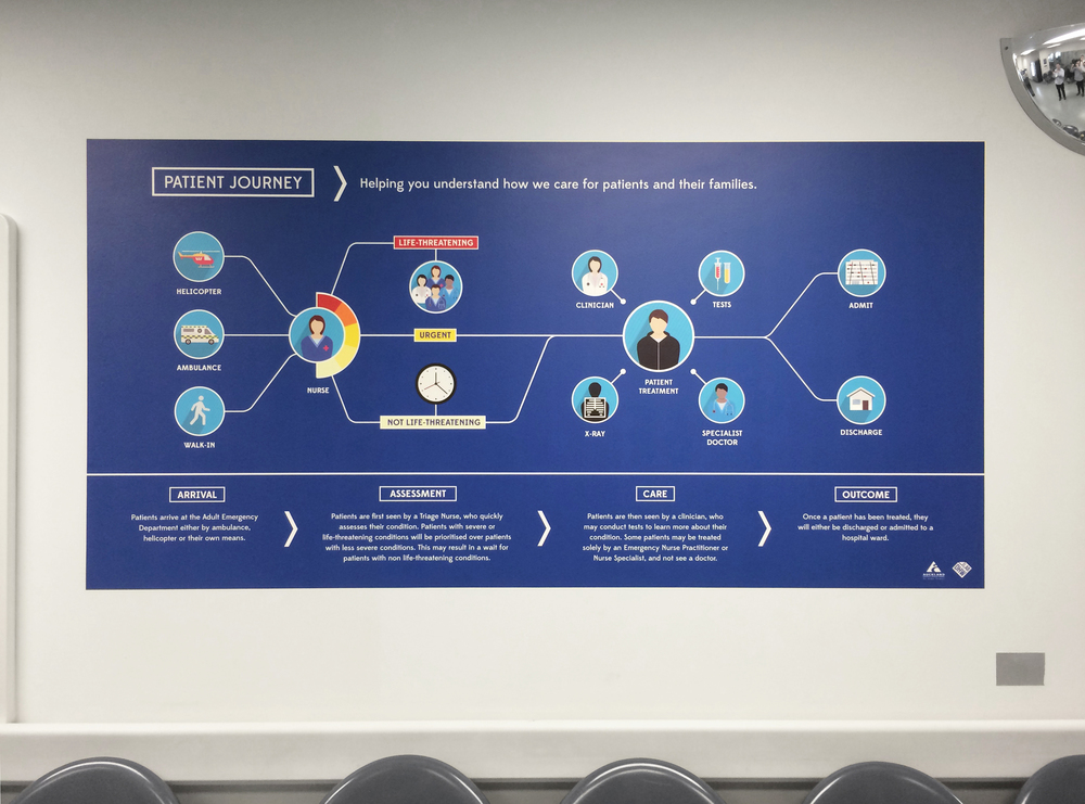
Much of our recent work and collaboration with ED staff has focused on the development of the ED Signage and, as a result, development of the main project - Patient Pathway - has somewhat slowed. In order to give this project new momentum, we needed to get some real feedback on our current understanding of the Adult Emergency Department patient journey. We had developed a series of journey map iterations and a graphic/visual language, which we were able to present to the Facilities Nurse yesterday for discussion and feedback. This was the first opportunity to get some critical feedback from ED staff, and would allow us to test our initial assumptions/understanding and push the project forwards. Feedback regarding visual iconography:
- As clinicians, we have the responsibility to communicate more to patients
- Generally doctors in ED wear blue scrubs, surgical doctors wear teal, specialists wear mufti, nurses wear blue scrubs, charge nurses wear red, flow nurses wear green - overall, not very clear
- Coloured, detailed icons could be used to demonstrate/communicate different staff roles
- Medical equipment details could also be used to differentiate roles - e.g. clinical staff wear stethoscopes, non-clinical do not
- A colour key could help patients/families understand the different staff roles within ED
- Plain, white icons are quite good for keeping things neutral - gender/culture
- Would be useful/helpful to explain different triage categories
- Helpful to communicate and define department terminologies - Triage is a term we want to educate people around; it is internationally used and has an interesting historical background
Feedback regarding journey map:
- Walk-in patients and patients brought in by ambulance all come through triage
- Triage direct St John paramedics to different areas
- Triage is a key component of four stages: Arrival, Triage, Nursing Assessment, Medical Assessment
- Five main areas: Resus, Acutes, Monitoring, waiting room and APU
- No matter what location, each patient is assessed by a nurse
- As a patient story develops, their category/priority may change
- Tests generally happen before being seen by a doctor
- Not all cases are 'injuries' - may be medical or surgical problems also
- Final stage should simply be kept to 'Admitted' or 'Discharged'
- As for the location of the journey map, it was suggested we replace the large mat hung on the waiting room wall
With such a complex set a variable care pathways, it is tricky to refine a journey map down to a simple, coherent graphic. Our current line of thought focusses the journey map on a central ‘care cycle’ where tests as well as doctor and nurse assessments can take place in any order (as is often the case in ED).
