Ward signage fitout

5eb75-img.jpg

The Lab has been working with an internal hospital project team to improve ward signage. Our goal is to make simple, bold signage elements that form a coherent wayfinding system.

In adjacent wards, there are no cues to show you have moved into a new ward. Two distinct shades of blue are used in the wayfinding system to help indicate this zoning. A third, darker shade of navy blue is used for directional signage and amenities.

338ba-img.png
7642f-img.png

The system is currently on trial in ward 62. An older prototype is also visible on level 8 of Auckland City Hospital. See images of ward 62 here:

147ac-img_0208.jpg
e5f1f-img_0210.jpg
c1523-img_0214.jpg
3a16f-img_0206.jpg
f2426-img_0216.jpg
d7e86-img_0219.jpg
df9d8-img_0227.jpg

Transition Lounge Signage

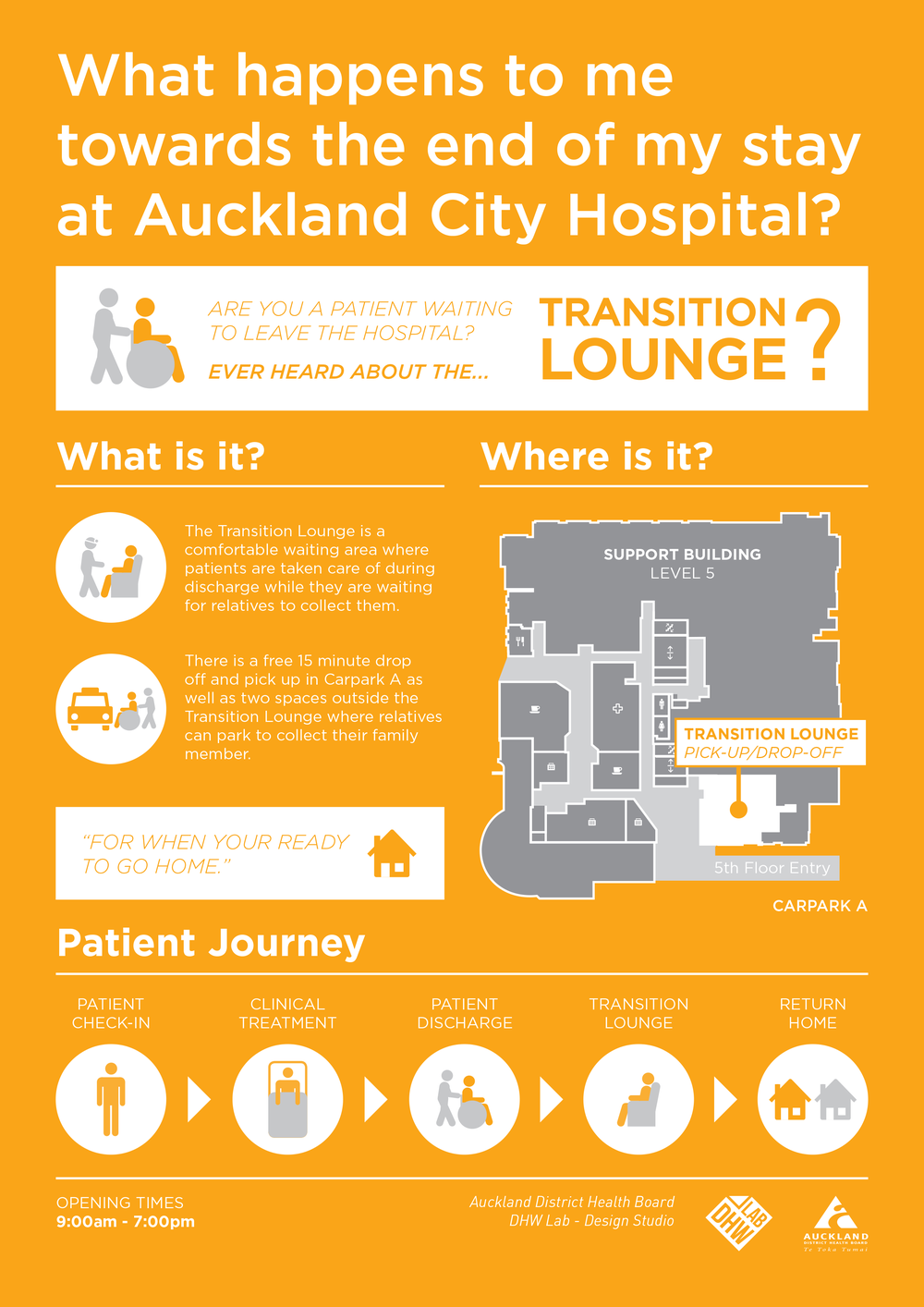
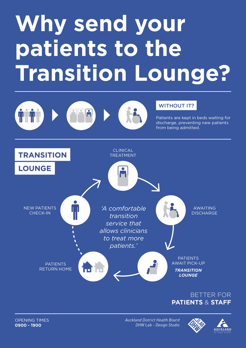
As apart of the lab's work to improve public spaces, we are working with staff on a campaign to help both patients and other hospital wards understand how to use the Transition Lounge:Transition Lounge Awareness Patients Final Transition Lounge Awareness Staff Final

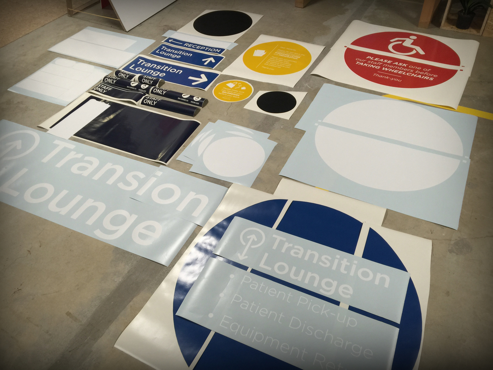
In addition to this campaign, we are testing a new signage and way finding language in the space. Using an in-house vinyl cutter we are able to quickly mock up signage solutions and test there suitability before install.

Transition Lounge

The hospital campus in 3D

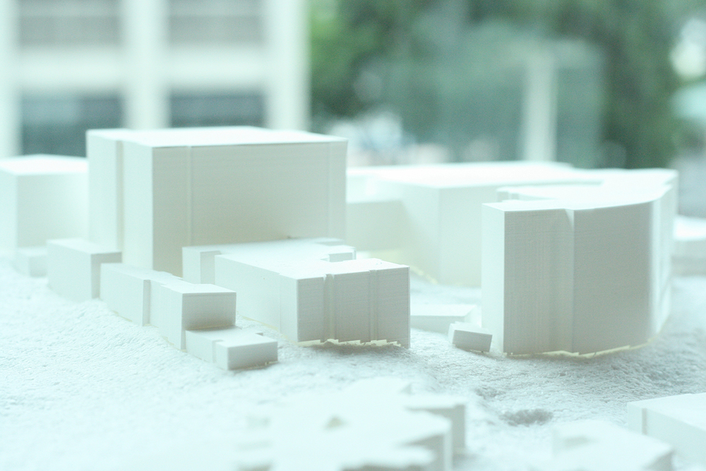
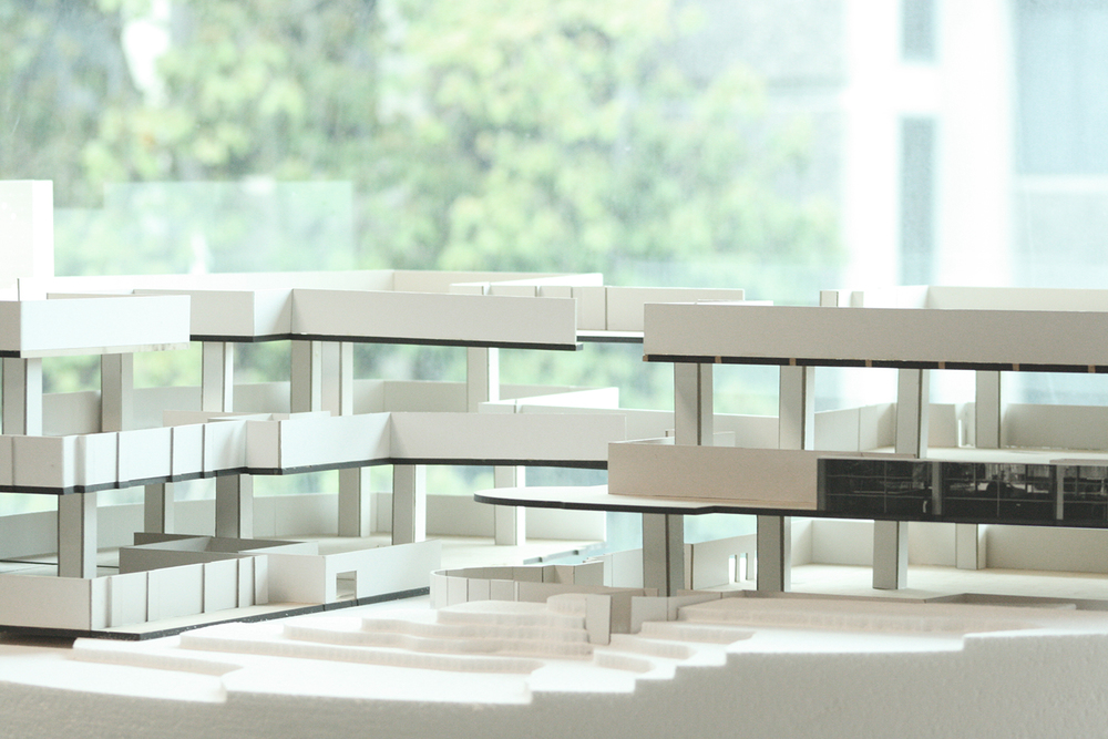
site plan Recently, two spatial design graduates were contracted to build 3D scale models of the Grafton hospital campus. Two models were constructed: one of the park road entry points to the hospital and the other a 3D campus map.  The purpose of the models were to help the dialogue around establishing the main entrance to the hospital and how this decision affects the campus as a whole.

In contrast to schematics, working with physical models has afforded more useful dialogue around these questions of hospital infrastructure and navigation.

Entrance Entrance2

Temporary Signage: Level 5

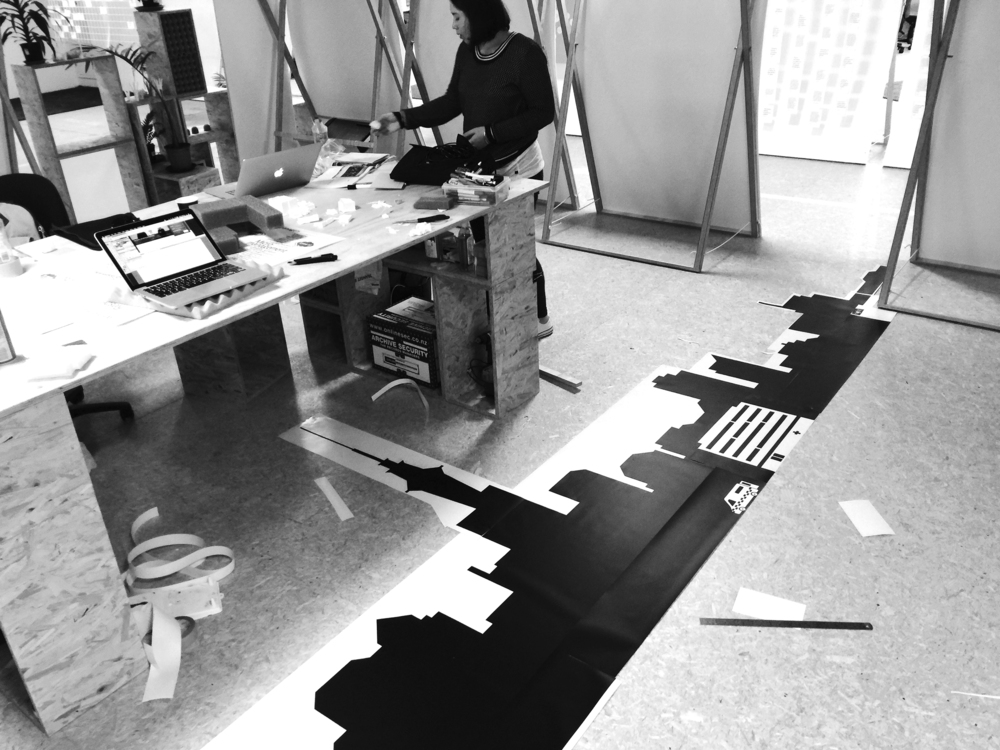
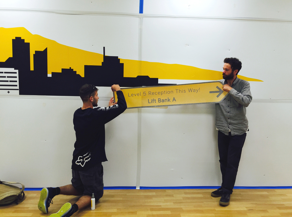
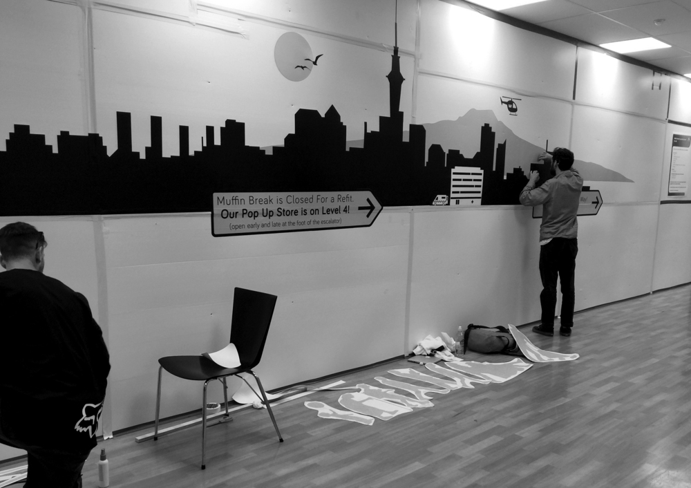
Recently, some construction work has taken place in the Level 5 retail space creating a bottle neck around the staff cafeteria. The Lab has installed a way finding mural in order to help the flow of people into the over bridge and reception area. It was exciting to hear people's feedback as we installed the piece. The colour and playful aesthetic has created quite a talking point for both young and old!

stage 1 stage 2 stage 4 stage 5 stage 6 stage 7

LAB studio development

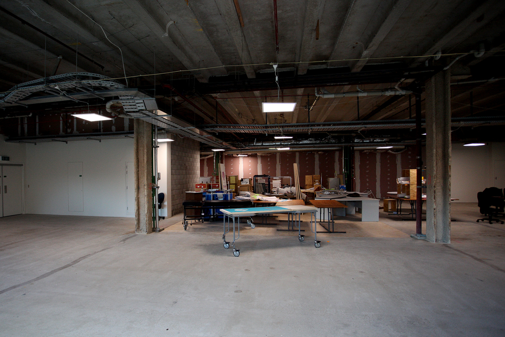
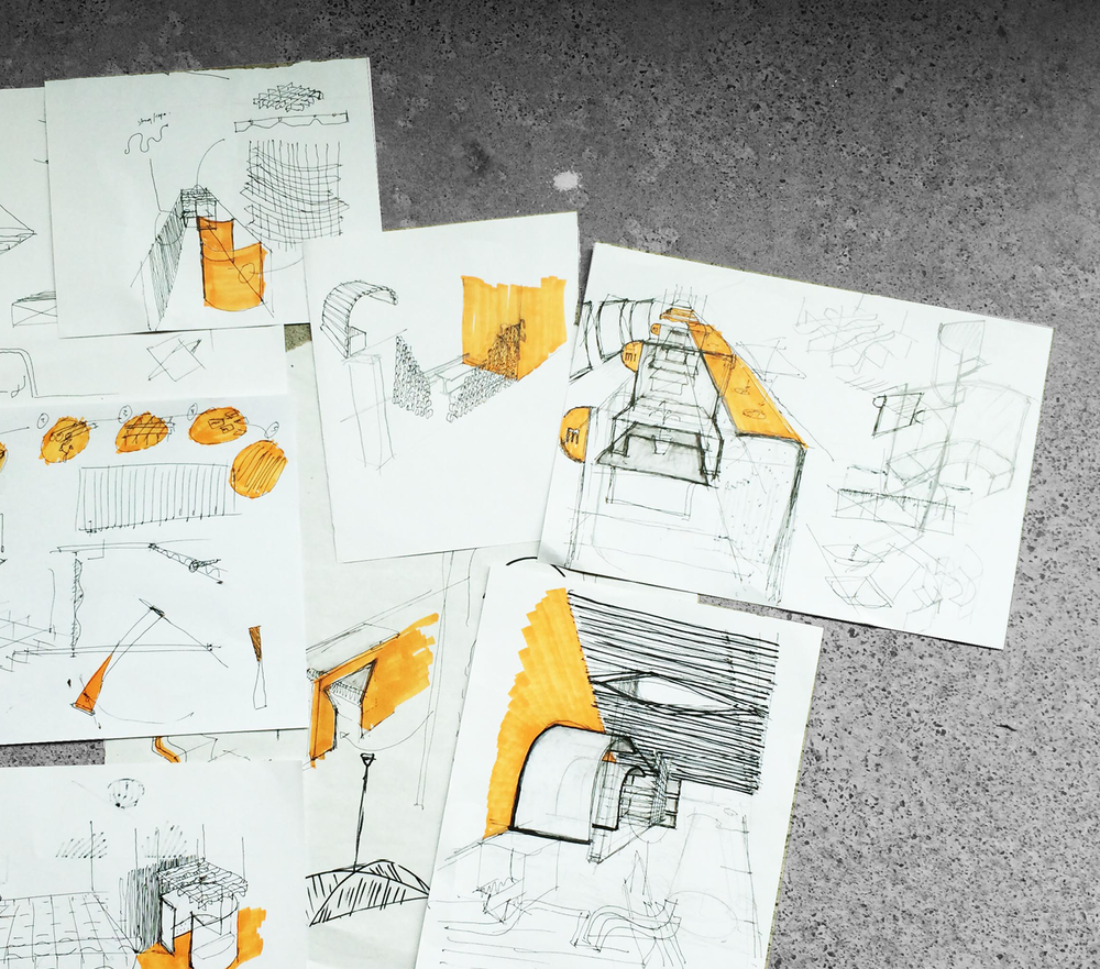
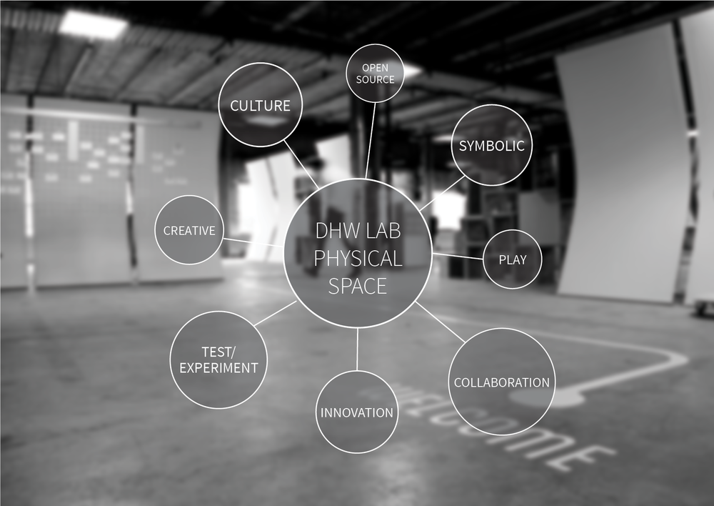
fitout web2 With the capacity of the Lab looking to grow in 2015, it is vital that a functional working environment is available for new Lab contributors and ADHB staff members to work in. These images show the proposed concept for a private working area and meeting space, to be developed in the theme of the semi permanent fit out.

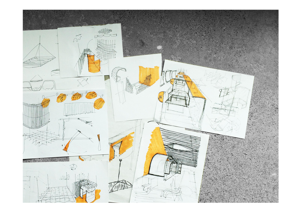
Full scale prototyping of physical spaces is an area of demand within the hospital.

‘In house’ exercises such as these act as a suitable trial for future full-scale space mock ups. For example, private booths for both the public spaces and other office areas of the hospital are to be prototyped in the Lab space.

fitout web

fitout web3 fitout web4