STAFF AND CLINICIAN NOTE BOOK

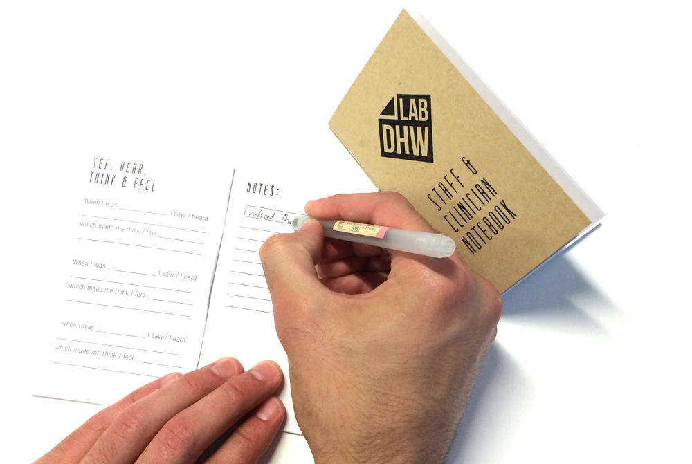
Synthesising user insights can be a real challenge while researching new design opportunities. In the context of the Emergency Department and Auckland Hospital, staff have been trained to work in a certain way, following specific terminology and protocols in order to run an efficient Emergency service. Day in and day out they encounter patients who are unable to make sense of the service pathway they offer and they work around clumsy or unconsidered aspects of their graphic, spacial or product environment... The DHW lab 'Staff and Clinician Notebook'  has been developed to help the Staff and Clinician user group to capture key insights from their day to day experience of the ED. The notebook is a practical way in which designers are able to catch a glimpse inside a patients' pathway through the ED  from a staff perspective.

Key methods from the notebook include:

See, hear, think feel - A simple fill in the blanks exercise aimed at unpacking specific service situations in the ED.

Test your Assumptions - A reflective tool designed to question assumptions the staff make about the ED patient experience.

The Five Whys - Used to delve deeper into the underlying motivations for a specific behavior or opinion.

Storyboarding - A series of drawings that visualise a specific patient experience in a sequence of events.

Heres' an Idea - An opportunity for staff to write down or draw ideas they have for how to improve the patient journey through ED.

This first Iteration of the 'Staff and Clinician's Notebook' is a prototype. Testing this Method and receiving feedback from staff will allow us to improve and refine this research technique for the projects ahead.
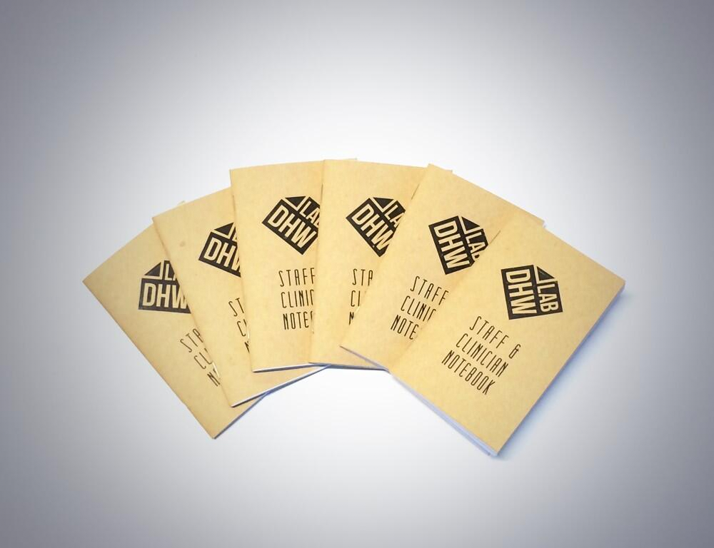

notebook

Project: Identity

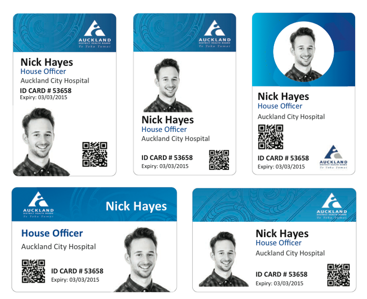
A current side project underway at the lab that involves rethinking the design and function of the hospital ID card. Typically, the ID card is attached to a lanyard hanging around the neck of a staff member. They can also be clipped onto clothing.facelift At face value, the project seemed to be re-branding exercise, redesigning the graphics of the current card. But pushing the boat out a little, we began to question what the underlying purpose of the ID card was: How easy is it for patients to identify staff members?  What are the key problems with the existing, lanyard/clip system? With a little research, we discovered that staff carried around three items on their lanyard: an Id card a coffee card and swipe card- how might such functions be combined or integrated? A nurse tipped us off about the infection risk of lanyard card holders, and some key secondary sources  supported this issue of spreading infection through the current system. How might an ID card system actively promote sanitation as staff move around the hospital? With these new insights, we have jumped back into ideation around this problem, and are looking  for opportunities to develop an ID system that is both feasible and effective for all users: Thinking broadly around the clothing and apparel worn by hospital staff.

sketch design

ED: Patient Pathway/ Icon Ideation

IMG_1572 iconsideation

Here is a quick update of some graphic design work underway in our ED patient pathway project. Currently, we are looking at developing a highly visual journey map to explain how patients are prioritised in ED and their subsequent care pathway.

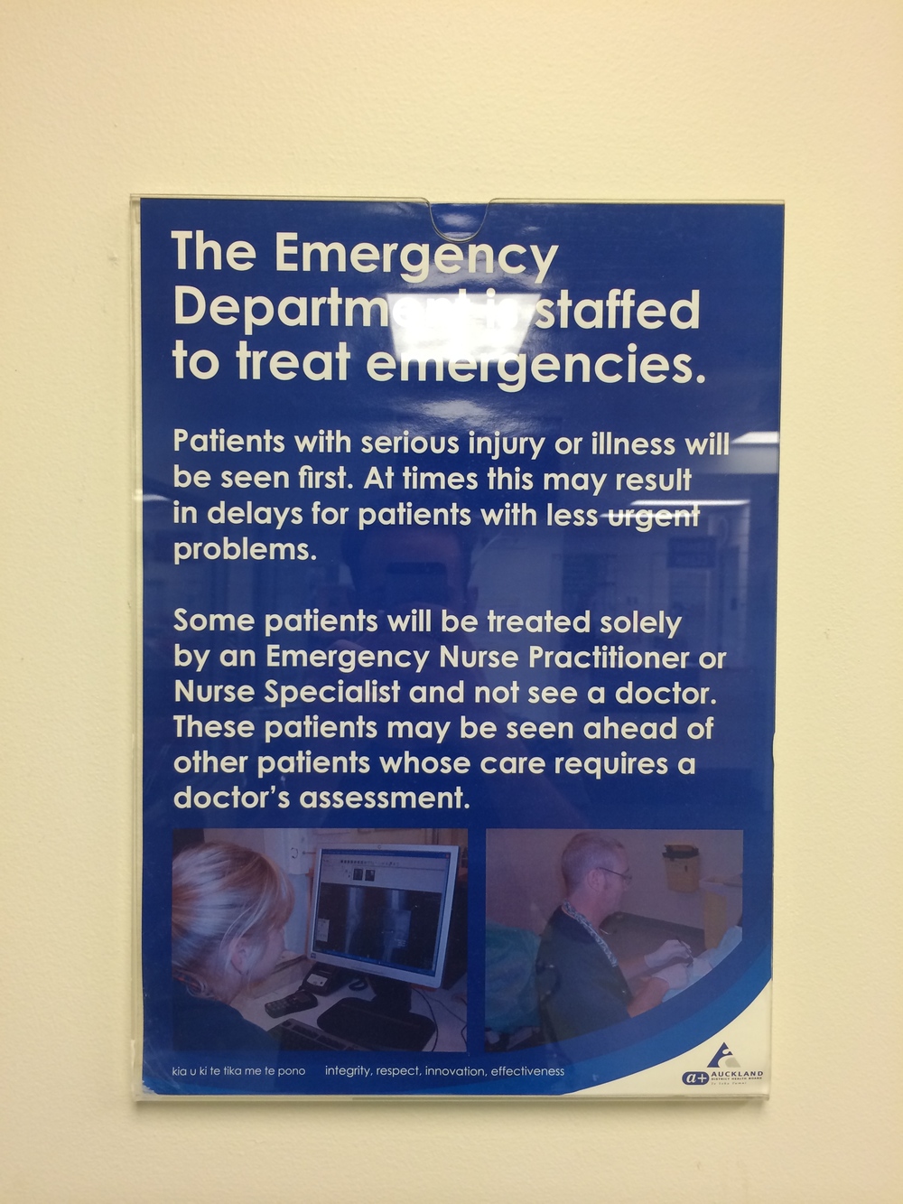
Explaining information to people through text  may be very informative and thorough, but an A4 poster on a blank wall often goes unnoticed, and makes no sense to a person who does not speak English. We have embarked on developing a family of descriptive and clear Icon/symbols communicating key messages to patients who have to wait in the ED.

It is no secret that symbols are an effective method for communicating without relying on text: our challenge is to develop a clear visual language which both fits the hospital environment and engages those waiting for care. Some of the work featured here moves away from conventional human figure icons and begins to explore how restrained yet playful style might better communicate with patients. How much detail could be used in the iconography before becoming overly complex? This practical design work will be shaped and developed as we continue to sure up our key research insights.

ED: Patient Pathway / Visual Mapping

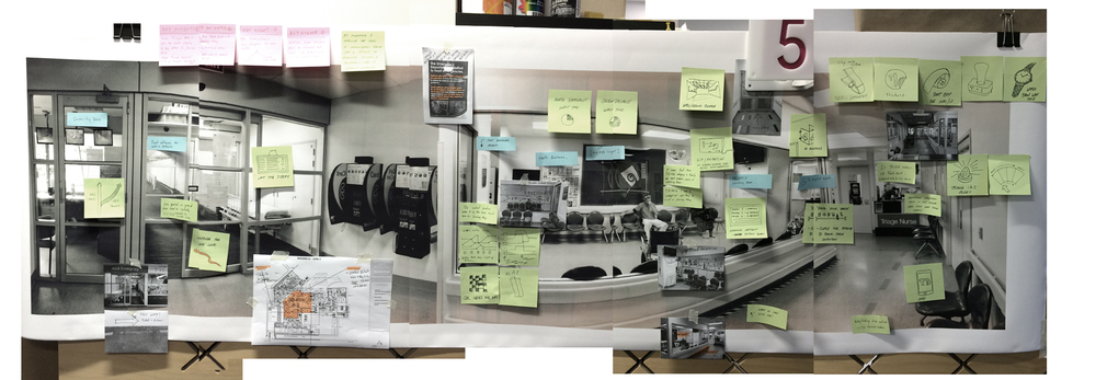
A crucial aspect to redesigning how patients interpret their journey through ED, is for designers to understand the complexities of the scenario from a variety of perspectives. Often this process of information gathering can be some what overwhelming, especially with potential solutions swirling around with new research discoveries. To direct this phase, our goal is to distill a series of  key insights that will inform a project mission statement and a clearer project brief. A large panoramic photo of the waiting room space (our current focus point for displaying the patient pathway) has served as a canvas for recording findings, spontaneous design concepts, service improvement ideas and further questions we might have...

visual mapping

ED: Patient Pathway / Prototyping

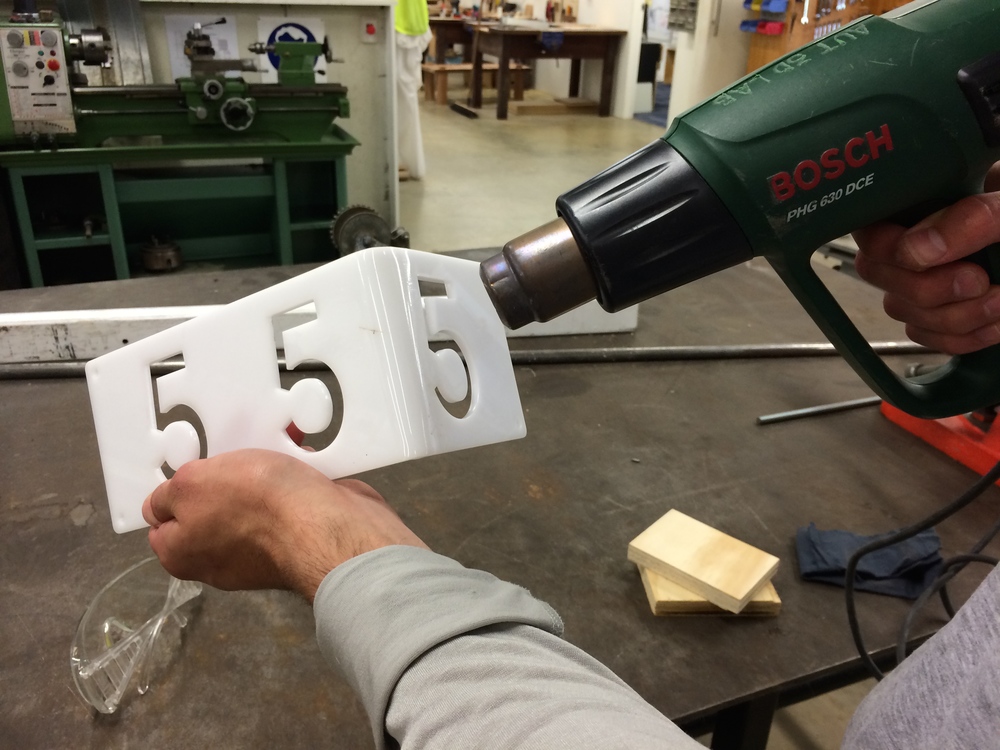
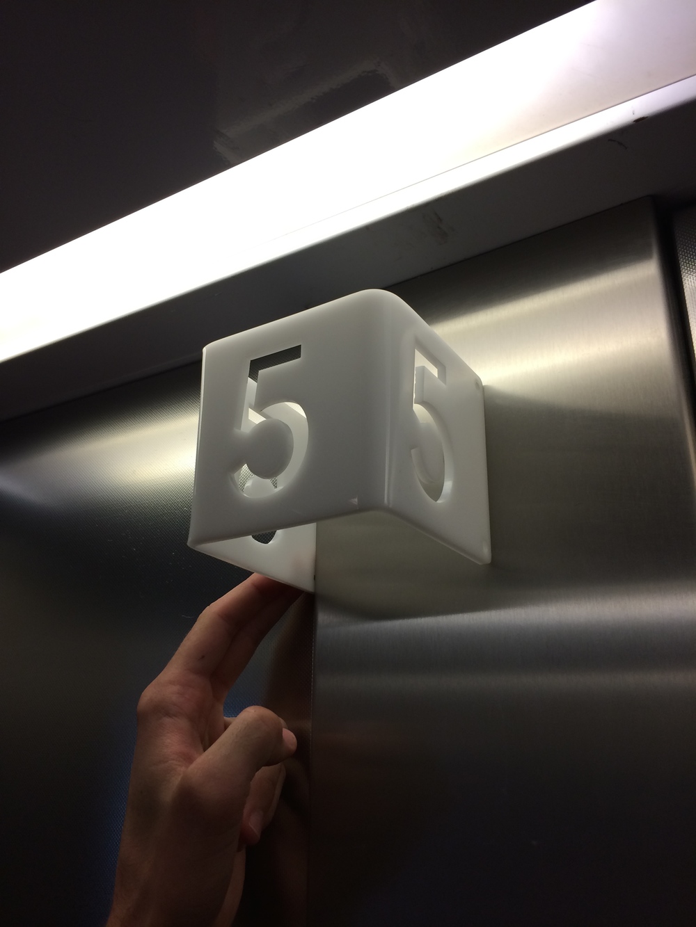
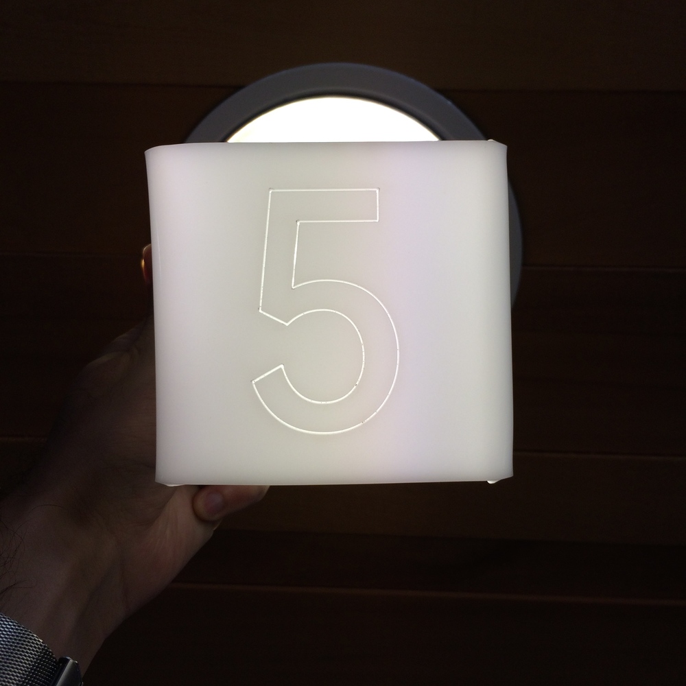
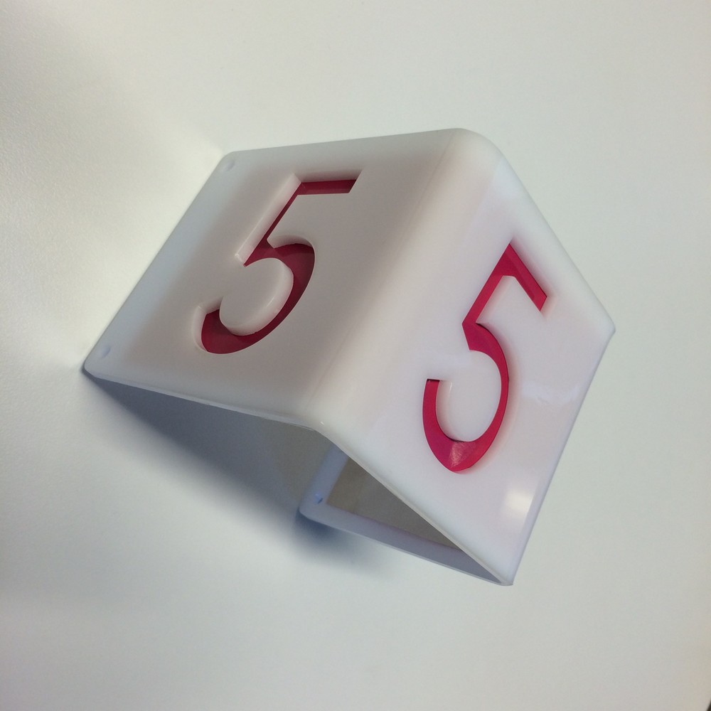
Following our recent walkthrough of the Emergency Department, we began mapping out our current understanding of the patient journey. During this process, several ideas sprang to mind around how the patient/staff experience could be improved. A core value of the DHWLab design methodology is to quickly prototype and test ideas early in the process, before investing time in detail design. Getting ideas down on paper and efficiently mocked-up is also a great way to encourage creativity and momentum in the research process.Below is a quick prototype responding to the inadequacies of current room signage within ED, as identified by the nurse manager. Staff and patients often find it difficult to identify and locate different rooms within the department as a result of insufficient and unclear, 2D wall signage. This concept responds to these issues through a simple 3D wall-mounted sign, which may be more easily visible from all directions.