Discovery Week: Public Spaces

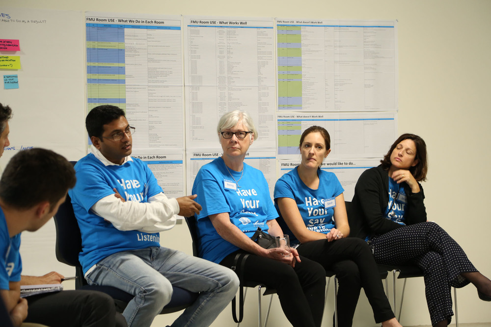
The Auckland DHB has recently been working on a research project, to understand peoples' experience of the public spaces at the Grafton campus. The Lab has been involved in this project by developing the researching methods used to interview people, and in packaging up/documenting the project. haveyoursay
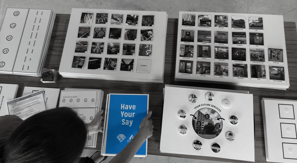
'We want to discover what our staff, patients, families and visitor’s current experience are of our public spaces within Auckland City Hospital.  We have defined our public spaces to include the main entrances on levels 1, 4 and 5 and the retail space and eating areas on level 5.

We can only get this right if the people who use these places help us design a better place together.

How to get involved

To get this underway we are kicking-off with a Discovery Week 7- 13June.  During that week there will be lots of opportunities for staff, our patients their families and other visitors to tell us: how you currently use the spaces; what you think about the shops and services on offer; how the entrances and exits work, and about the places to eat.

Have your say by completing our online survey  or go along to the interactive workshop for staff on Thursday 12 June 10am to midday.  To book a place emailfirstimpressions@adhb.govt.nz with your name, position and contact number.'

http://firstimpressions.adhb.govt.nz

haveyoursay2 haveyoursay3

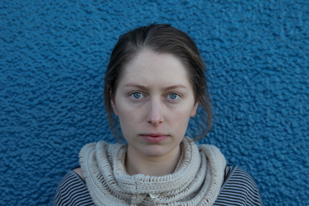
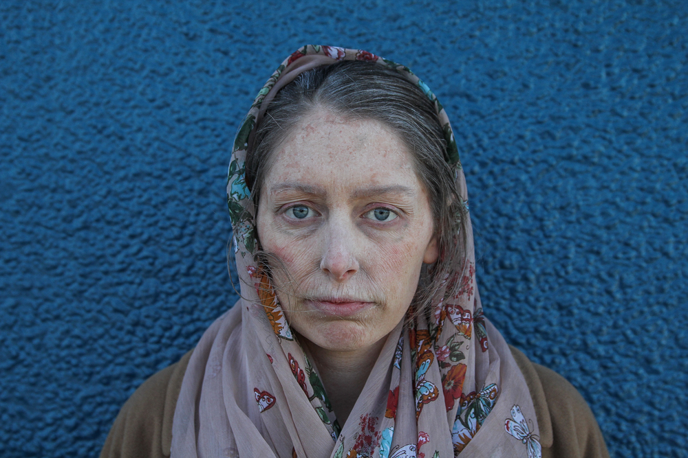
Role-play: Empathy for Elderly

Before After

[embed]https://www.youtube.com/watch?v=uhVL-MbaANQ[/embed]

Honours student Lauren Hyland recently undertook a role-play exercise to help her gain empathy for elderly patients in public healthcare. Much more than a simple exercise in acting, Lauren fully transformed her visual appearance and identity, with the help of make-up artists at BodyFX, into that of an ill-looking, frail elderly woman. Following her radical transformation, Lauren immersed herself in the context of public healthcare at Auckland City's Public Hospital at Grafton, providing her an interactive environment to act out the experience of her users. Lauren reflects on the exercise and her experience below:

This practice-based research project explores the complexity of human needs and social values to assess how physical privacy for vulnerable patients can be improved through a product design intervention. Through the application of Human-Centred and Universal Design frameworks, this project focuses on addressing the needs and values of our ageing population through empathic design.

My key insights were gained through the use of ‘Role-Play’ as an explorative, empathy gaining method. With the help of BodyFX - the make-up & prosthetics specialists - I was able to fully embody what it is like to be an elderly patient by experiencing a day walking in their shoes. I allowed myself to be immersed into the moment - feeling vulnerable, overwhelmed and at times invisible or ignored.  

This has proven to become my most valuable research method to date, providing myself with the experience and empathic understanding for how I might implement a design intervention to better meet the needs of the elderly and ultimately preserve their dignity in care.

These insights reflect a key milestone in my project’s purpose and direction going forward.  With these considerations in mind, I have developed a new problem statement: how might we provide protection and privacy for elderly patients whilst supporting their visibility in care? 

Patient Pathway: Stage 1 Delivered

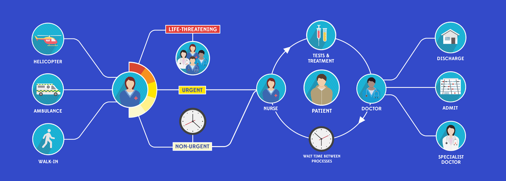
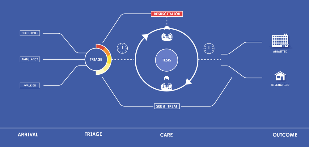
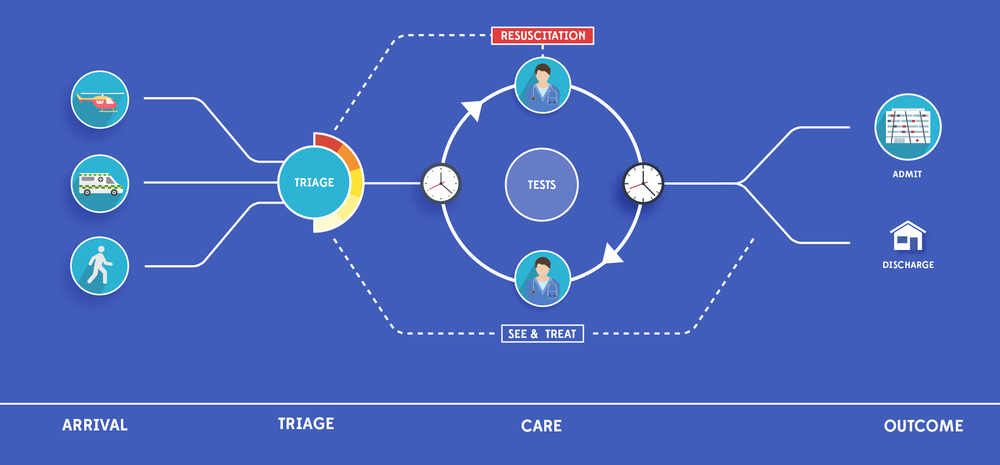
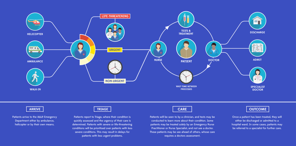
This project has been undertaken with staff in the AED at the Grafton campus, Auckland DHB. We have sought to understand and unpack the journey of a patient through the Emergency Department, and visually communicate to patients how the service works. This is of specific importance for patients and family who have to wait for long periods during their care, as other patients with more severe conditions may have been prioritised over them. With such a large number of care pathways that a patient could experience, the challenge has been to design a simple and understandable representation of the whole service. The goal of the project is that patients and families who have a clearer picture of why they must wait (for example, because staff resource is being tied up with a life threatening emergency) will have reduced levels of anxiety and frustration. Designing out complexity has been the main challenge of this graphic design exercise.

Project Mapping

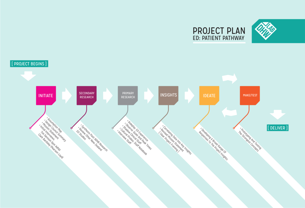
Project Plan ED plan

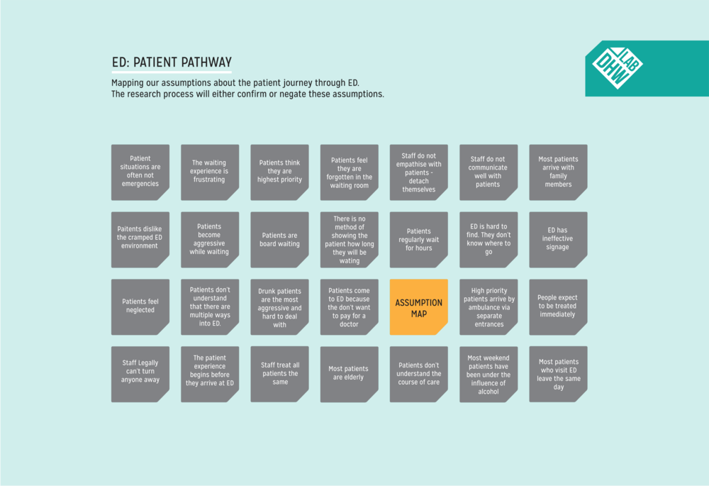
Unpacking the AED Waiting room experience.

stitch headerAssumption map Designing Iconography and developing a visual language to represent different people and processes in the AED.

Icon Ideation

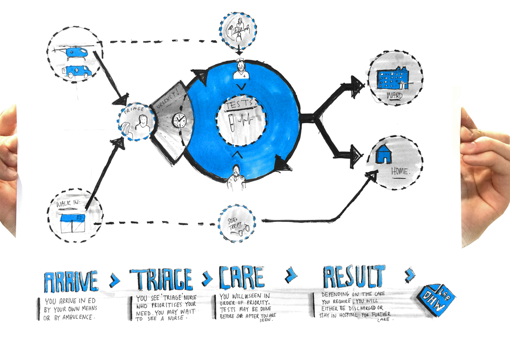
Iterating and refining a simple, high level map of how patients move through the AED.

journey map sketch smalljourneymap

Screen Shot 2014-04-14 at 4.53.20 pmScreen Shot 2014-04-22 at 12.21.52 pm

The final design was achieved by working Collaboratively with AED staff.

Final Journey Map dark

The next stage of this project is to receive formal feedback from users and develop an animation for screens situated in the ED waiting room as well as flat vinyls at different points the AED.

Print Collage Whitesmall

AED Signage

01a56-sketchdevelopment2.jpg
sign making imge
sign making imge

The first run of signage has been installed in the AED at Grafton campus. This project has been developed on and off over the last few months, so here are some reflections / key learnings to summerise:

- Simple ideas. It's important not to overcomplicate simple problems. We identified a need; current signage for the AED is on flat walls and doors that are often open making it difficult for patients, family and new staff to navigate the open plan space. We responded to the need with a multi-faced signage cube, visible from all angles.- Prototyping quickly and talking to users with prototypes in-hand is very efficient. Sketch designs and CAD work can only go so far in explaining a concept.

- Make mistakes quickly. For a simple project like this, testing prototypes in the space is vital. It was here that staff and users could voice feedback immediately and key design strengths/flaws were uncovered. For example: We played with the idea of retrofitting the sign to the current warning LED panels above each room. The idea received mixed feedback and it was concluded that the signage obscured the warning light from some angles.

- Make friends along the way. The trust that has developed from solving a problem together with AED staff is invaluable. Moving forward, we have developed working relationships to tackle more complex problems ahead.

- Learn by Doing. As we  seek to design better healthcare experiences for patients, families and staff, small projects like this help us to define the way we best work together.

Moving forward a longer term manufacturing and supply plan needs to be set in place, as well as developing potential back-lit versions to function as 'room in use' markers.

ED Signage 1
ED Signage 1
ED Signage 2
ED Signage 2

ED: Patient Pathway Signage Process

a651a-photo-8-05-14-4-54-26-pm.jpg

Since our last post on the ED signage project, we have spent some time resolving the details of the physical form, typography, colour and sourcing materials. We slightly extended the length of the sides of the sign, whilst retaining a more square profile for the front face. This allows the letting to sit further out from the folded edge where it attaches to the wall, improving visibility. We managed to find a soft-looking, white matte acrylic material to use for the signage body, and experimented with a variety of coloured vinyls for the typography. After consulting with staff in the Adult Emergency department, we settled on a matte red vinyl which creates a consistency with the red wayfinding line that runs through the department. The combination of low reflective, matte materials allows the typography to 'pop' off the body of the sign, which disappears into the white walls.

a651a-photo-8-05-14-4-54-26-pm.jpg

Having resolved these finer details, we are now ready to produce a small batch run for the Adult Emergency department. We developed a CNC routed MDF former, which we will use to manufacture the first lot of signs. The process is very simple and straight forward: the sign blanks are laser cut out of a flat sheet of acrylic, which we then attach to the MDF former and use a heat gun to bend around the corners of the former. Finally, we cut the lettering from a vinyl sheet then press it to the folded blanks. Easy. We're excited to get these up in the ED to see how patients and staff respond to them, and to document the effect they have on improving wayfinding within the department.